Architect
Architecture Architect Problems Apron Featuring Sarcastic
Architecture architect problems apron - Black distressed text ARCHITECTS BECAUSE ENGINEERS NEED BABYSITTERS
US$19.95
Flat US$4.95 US shipping · free over US$65.00 · sales tax is calculated from your shipping address at checkout.
1
US$19.95
Delivery to United States
Arrives —
Orders ship within the United States only. Flat US$4.95 shipping under US$65.00 — free from US$65.00.
Returns
Request a return or exchange within 30 days of purchase, for any reason — we cover return shipping.
Printed to order
Every apron is printed after you order it. Please allow 1-3 business days for processing before it leaves the print shop.
Architecture Architect Problems Apron Featuring Sarcastic is printed on a black canvas apron — one size, made to order and shipped within the United States.
architecture architect problems apron puts the phrase ARCHITECTS BECAUSE ENGINEERS NEED BABYSITTERS across the front panel, and the words read as a sarcastic commentary on professional hierarchy. Wearing it signals to colleagues that you appreciate the distinct role of your trade, and architects who enjoy teasing engineers find this message perfectly aligns with their daily work life.
A Closer Look At The Artwork
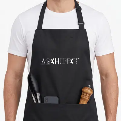
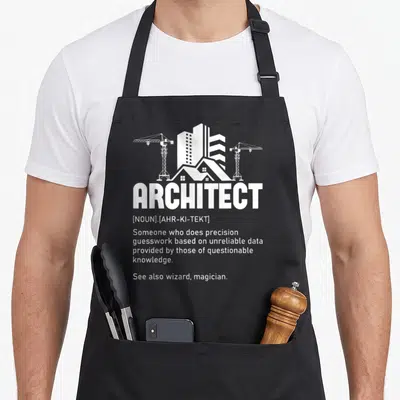
The central subject is a stack of four lines printed in black distressed typeface. The top line features the word ARCHITECTS where the letter A is shaped like an open drafting compass. Below this, the phrase BECAUSE ENGINEERS appears in a condensed sans-serif font. The third line centers the word NEED, which is flanked on both sides by small city skyline silhouettes. The final line completes the statement with the word BABYSITTERS. This layout uses only text and simple graphic icons to deliver a humorous message about the relationship between design and engineering disciplines.
Where It Earns Its Keep
Architects and interior designers notice the specific rivalry referenced in the slogan immediately. Gifting this architecture architect problems apron to a planner or designer acknowledges their unique perspective on construction projects. It gets worn in busy studios or on active job sites where such professional banter is common and appreciated by fellow tradespeople.
Good To Know
What are the dimensions of the pockets on this apron? Each pocket measures exactly 8 x 7 inches, providing ample space for holding tools or notebooks. They are positioned on the lower front panel to keep essentials accessible without interfering with the main graphic above. The fabric holds its shape well enough to keep items secure even when the material is new.
How does the ink hold up after repeated laundering? The distressed black print remains durable because it is bonded directly into the heavy cotton canvas fibers. The texture of the fabric helps anchor the ink, preventing the cracked aesthetic from peeling or fading prematurely. Standard washing cycles maintain the integrity of the design without requiring special cold water treatment.
Why is a drafting compass used instead of a standard letter? The compass replaces the A in ARCHITECTS to visually distinguish the profession from generic text. This specific drafting tool represents the precision and manual skill associated with traditional architectural drawing. It acts as a symbolic signature that validates the wearer's expertise before they even read the rest of the sentence.
Every apron is printed after you order it. Orders are processed Monday through Friday, excluding federal holidays — please allow 1-3 business days for order processing. After processing, shipping typically takes 3-7 business days inside the United States, so the total delivery time from order placement is 4-10 business days.
US orders under US$65.00 pay a flat US$4.95 shipping; orders of US$65.00 or more ship free. Bearhap ships within the United States only — we do not ship to international addresses.
You may request a return or exchange within 30 days of the purchase date, for any reason. The apron must be unopened, unused and in its original packaging, with proof of purchase. We refund the item price in full to the original payment method — the original US$4.95 shipping fee is not refundable — and Bearhap covers all return shipping costs: email contact@bearhap.com for a free return label.
Care
Machine wash cold, inside out, with like colours. Tumble dry low or hang to dry. Do not iron directly over the print — press from the back if you need to. No bleach, no dry cleaning.
The ink is water-based and cures into the fabric, so it will soften with the canvas rather than peel off it.
Questions about Architect aprons
- Who is the ideal wearer for this collection?
- This collection suits licensed architects, interior designers, and architecture students who want to express their professional identity. It appeals to anyone who appreciates the intersection of artistic vision and structural logic in their daily workflow.
- What specific designs are included here?
- You will find pieces like the ratio golden apron celebrating mathematical proportions and the reaper architect apron referencing deadline pressures. These designs target those who enjoy niche references related to drafting, scaling, and building concepts.
- How do I choose the right one?
- Select based on your current focus, whether it is theoretical study or practical site work. The ratio golden apron fits theorists, while the reaper design suits those facing heavy project loads. Choose the theme that best matches your current professional mood.
You might also like
More architect
- meaning architect problems apron
- architect easy apron
- architecture definition architect apron
- architect graduation student aprons
- funny architecture architect apron
- architect building apron
- architecture designer apron
- architecture engineer apron