
Group Photo
Burst Collage Anime Character Apron Featuring One Piece
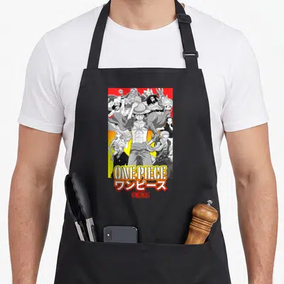
Burst collage anime character apron - One Piece text and Monkey D Luffy group art on yellow starburst
US$19.95
Flat US$4.95 US shipping · free over US$65.00 · sales tax is calculated from your shipping address at checkout.
1
US$19.95
Delivery to United States
Arrives —
Orders ship within the United States only. Flat US$4.95 shipping under US$65.00 — free from US$65.00.
Returns
Request a return or exchange within 30 days of purchase, for any reason — we cover return shipping.
Printed to order
Every apron is printed after you order it. Please allow 1-3 business days for processing before it leaves the print shop.
Burst Collage Anime Character Apron Featuring One Piece is printed on a black canvas apron — one size, made to order and shipped within the United States.
burst collage anime character apron puts the words ONE PIECE across the front panel, and the vertical lettering reads as a title for the central group. The design features Monkey D. Luffy leading a cluster of crewmates against a yellow starburst background in blue, yellow, and red cartoon style. Wearing it displays specific knowledge of the series without needing explanation, and fans who recognize the crew layout feel this was made for them.
Inside the artwork
The burst collage anime character apron places the text ONE PIECE in a split vertical layout on the left and bottom edges of the front panel. A group of characters is clustered in the center against a yellow starburst background, utilizing a palette of blue, yellow, and red. The main subject Monkey D. Luffy stands prominently in the foreground with his hand raised, surrounded by his crew in a cartoon art style. This arrangement frames the action within the typography, creating a unified visual block that belongs to the pirate adventure genre. The combination of the bold, outlined lettering and the dynamic character poses results in a cohesive tribute that prioritizes clarity and impact over decorative excess. The yellow starburst serves as a unifying field behind the figures, ensuring they remain distinct from the background while enhancing the sense of energy radiating from the center. Blue outlines define the text and some character details, contrasting sharply with the warm yellow backdrop and the red accents found on specific items like hats or clothing. This strict adherence to the three-color limit gives the design a graphic quality that mimics the look of printed posters or promotional materials. The vertical stacking of the word ONE draws the eye upward from the bottom anchor of PIECE, guiding attention directly to the central figure of Luffy. This directional flow reinforces the hierarchy of the image, establishing the leader as the focal point before the viewer processes the supporting cast. The cartoon style simplifies complex forms into recognizable silhouettes, making the group identifiable even at a glance or from a distance. Each character occupies a specific space within the cluster, avoiding overlap that would obscure their individual features or the overall composition. The result is a balanced assembly that feels both crowded and organized, reflecting the chaotic yet loyal nature of the crew itself. The starburst pattern extends outward from behind the characters, suggesting motion and excitement without overwhelming the text or the figures. This graphical element acts as a spotlight, isolating the group from the rest of the apron's surface and emphasizing their importance. The interplay between the rigid, geometric lines of the letters and the organic, expressive poses of the characters creates a visual tension that adds depth to the flat design. The red elements, though sparse, provide necessary contrast points that break up the dominance of blue and yellow, preventing the image from appearing monotonous. These strategic color placements draw attention to key accessories or facial expressions, adding narrative cues without requiring explicit storytelling. The overall effect is one of energetic focus, where every element serves to highlight the central theme of the crew's unity and shared goal. The design avoids clutter by limiting its scope to the essential components: the title, the leader, the team, and the explosive background. This minimalism ensures that the message is communicated instantly and effectively, making it an ideal choice for fans who want to showcase their interest without ambiguity. The vertical text also allows the design to fit naturally within the tall aspect ratio of an apron, maximizing the available surface area without distortion. This thoughtful scaling demonstrates an understanding of how graphic design translates onto functional objects, bridging the gap between digital art and physical wearability. The final impression is one of confident simplicity, where the power of the source material is preserved through disciplined execution and strategic use of color and layout.
Who It Speaks To
This burst collage anime character apron speaks directly to dedicated fans who notice the specific arrangement of the Straw Hat Crew. It serves as a gifting occasion marker for birthdays or holidays celebrating shared interests in the genre. The everyday situation it gets worn in involves cooking or crafting while displaying clear allegiance to the source material through its distinct visual grouping. People who wear it are typically those who appreciate the detailed lore of the series and want to integrate that passion into their daily routines. The design appeals to individuals who value functionality alongside fandom, preferring gear that works hard as much as it looks good. It is particularly suited for home chefs or hobbyists who enjoy hosting gatherings where conversation about the series can flow freely. The apron becomes a conversation starter, signaling to fellow enthusiasts that the wearer is part of the inner circle of devoted followers. For gift-givers, it represents a safe yet meaningful choice because it targets a niche audience with high engagement levels. The specific mention of the group photo aspect acknowledges the communal nature of the fandom, where shared viewing experiences are paramount. Those who select this item are often looking to bridge the gap between their private consumption of media and their public expression of identity. The apron facilitates this transition by transforming a passive viewing experience into an active, wearable statement. It validates the time spent watching episodes or reading chapters by incorporating those visuals into a utilitarian object. This act of translation—from screen to fabric—resonates deeply with fans who view their interest as a lifestyle rather than a fleeting trend. The design’s lack of humor or irony further distinguishes it, appealing to those who take the source material seriously and wish to reflect that reverence in their attire. It is a badge of authenticity for those who have followed the series through its many arcs and transformations. The inclusion of the entire crew highlights the importance of teamwork and friendship, core themes that resonate beyond the plot itself. Wearers of this apron often find themselves in environments where their passion is understood and appreciated, reducing the need for constant explanation. The design thus functions as a social filter, attracting like-minded individuals while remaining accessible enough for casual fans to appreciate its aesthetics. Its versatility ensures it fits seamlessly into various settings, from kitchen counters to workshop tables, always carrying the same unmistakable signature of loyalty. In essence, it is more than just clothing; it is a tangible connection to a world that has become a significant part of the wearer's life.
Quick Answers
What are the pocket dimensions? The two front pockets measure 8 x 7 inches each and are split in the middle to allow for movement. This specific sizing provides ample storage for tools or ingredients while maintaining the structural integrity of the 10 oz cotton canvas fabric during daily use. The split design prevents the pockets from gaping open when full, ensuring contents remain secure whether you are stirring a pot or holding a notebook. The 8-inch width offers enough space for larger items like smartphones or recipe cards, while the 7-inch height provides sufficient depth to prevent spillage. The middle split also allows the pockets to conform to the body's shape, reducing bulk and improving comfort during extended wear. This engineering detail reflects a commitment to usability that complements the aesthetic appeal of the anime print. Users report that the pockets hold their shape well even after multiple washes, thanks to the sturdy nature of the canvas material. The dimensions are generous enough to be practical without becoming cumbersome, striking an ideal balance between function and form. The split construction also adds a subtle visual element that breaks up the solid expanse of the front panel, echoing the segmented nature of the text above. Overall, the pocket size is a deliberate choice that enhances the apron's utility without compromising its distinctive look. It ensures that the wearer can perform tasks efficiently while still showcasing the vibrant design prominently on the chest and upper torso. This attention to detail in the pocket construction underscores the product's dual nature as both a fashion item and a working tool. How does the ink hold up? The print remains durable because the 10 oz cotton canvas stiffens at first but softens after 2-3 washes. This fabric weight supports the ink application effectively, ensuring the blue, yellow, and red colors stay vibrant through repeated cleaning cycles without cracking or peeling. The initial stiffness actually helps protect the ink during the first few uses, acting as a barrier against friction and abrasion. As the fabric relaxes with washing, it conforms better to the body, reducing stress points where cracks might otherwise develop. The cotton canvas weave provides a stable base for the ink, allowing it to bond securely with the fibers rather than sitting loosely on the surface. Users can expect the colors to maintain their saturation for many washes, especially when following standard care instructions. The durability of the ink is matched by the resilience of the fabric itself, which resists tearing and stretching even under heavy use. This combination of material and printing technique ensures that the design remains crisp and clear throughout the apron's lifespan. The yellow starburst, being a large solid area, benefits particularly from the canvas's stability, preventing the common issue of fading or blotching seen in lighter fabrics. The blue outlines retain their sharpness due to the tight weave of the canvas, which prevents the ink from bleeding into adjacent areas. Red accents, though smaller, benefit from the same protective qualities, staying vivid against the contrasting background. Regular washing will gradually soften the fabric, but the ink's adhesion remains strong, preserving the design's integrity. This longevity makes the apron a worthwhile investment for frequent users who want their favorite artwork to last. The care routine is straightforward, requiring no special detergents or temperatures, which adds to the overall ease of ownership. The result is a garment that looks as good after a year of use as it did on day one, provided it is treated with reasonable care. This reliability is crucial for fans who want their apparel to withstand the rigors of daily life without losing its appeal. Why is this design unique? The layout splits the title vertically on the left and bottom to frame the central character cluster. This specific positioning creates a burst effect around Monkey D. Luffy that distinguishes it from standard horizontal banner designs found on other merchandise. The vertical text acts as a border, containing the energy of the scene and directing focus inward toward the leader. Most One Piece apparel places the logo separately or horizontally, but this arrangement integrates the title into the composition as a structural element. The starburst background radiates from behind the characters, reinforcing the sense of explosion and action that the vertical text implies. This synergy between typography and imagery is rare in fan merchandise, where text and art are often treated as separate layers. The design requires the viewer to read the text in conjunction with seeing the characters, creating a more immersive experience. The bottom placement of PIECE grounds the composition, preventing the vertical ONE from feeling top-heavy or unstable. This architectural approach to the layout elevates the design beyond a simple reprint of a poster, turning it into a custom-created graphic specifically for the apron format. The uniqueness lies in this holistic integration, where every element serves the overall visual impact rather than existing independently. It appeals to collectors and designers who appreciate thoughtful composition over mere replication. The split text also allows the design to adapt to different body types and apron cuts without losing its intended proportions. This adaptability ensures that the burst effect remains centered and balanced regardless of how the apron hangs. Such consideration for the medium's constraints demonstrates a level of craftsmanship that sets it apart from generic offerings. The result is a design that feels intentional and curated, rewarding closer inspection with its clever spatial relationships. It transforms a familiar IP into something fresh and visually engaging through sheer compositional ingenuity. This attention to layout detail makes it a standout piece for those who value design as much as fandom.
Every apron is printed after you order it. Orders are processed Monday through Friday, excluding federal holidays — please allow 1-3 business days for order processing. After processing, shipping typically takes 3-7 business days inside the United States, so the total delivery time from order placement is 4-10 business days.
US orders under US$65.00 pay a flat US$4.95 shipping; orders of US$65.00 or more ship free. Bearhap ships within the United States only — we do not ship to international addresses.
You may request a return or exchange within 30 days of the purchase date, for any reason. The apron must be unopened, unused and in its original packaging, with proof of purchase. We refund the item price in full to the original payment method — the original US$4.95 shipping fee is not refundable — and Bearhap covers all return shipping costs: email contact@bearhap.com for a free return label.
Care
Machine wash cold, inside out, with like colours. Tumble dry low or hang to dry. Do not iron directly over the print — press from the back if you need to. No bleach, no dry cleaning.
The ink is water-based and cures into the fabric, so it will soften with the canvas rather than peel off it.
Questions about Group Photo aprons
- Who should buy these aprons?
- These aprons suit photographers, event coordinators, and anyone organizing reunions or parties. They are ideal for groups who want a matching look that reflects their shared history or inside jokes without being generic.
- What themes are included?
- The collection features designs inspired by yearbooks, photo collages, and 90s nostalgia. You will find prints that mimic gallery walls or classic band aesthetics, all centered on the concept of a gathered group.
- How do I choose a design?
- Select a print based on your group's shared era or hobby. Choose the yearbook style for school ties, the collage for modern social media habits, or the retro theme for music-loving friends who bond over vintage culture.
You might also like
More group photo
- lunachick novelty apron
- retro princess apron
- wreck novelty apron
- retro square apron
- burst anime character apron
- collage anime character apron
- meet anime apron
- stardust anime apron