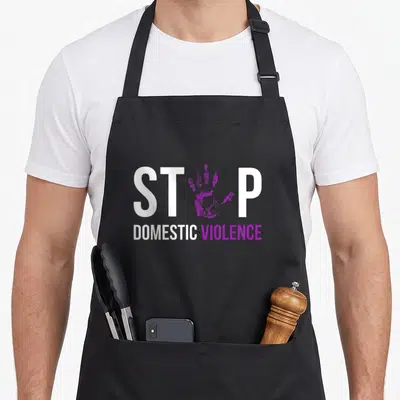
Domestic Violence Awareness
Hit Domestic Aprons Featuring Real Men Don't Hit Text
Hit domestic aprons - White stacked text reading Real Men Don't Hit with purple ribbon inside the O
US$19.95
Flat US$4.95 US shipping · free over US$65.00 · sales tax is calculated from your shipping address at checkout.
1
US$19.95
Delivery to United States
Arrives —
Orders ship within the United States only. Flat US$4.95 shipping under US$65.00 — free from US$65.00.
Returns
Request a return or exchange within 30 days of purchase, for any reason — we cover return shipping.
Printed to order
Every apron is printed after you order it. Please allow 1-3 business days for processing before it leaves the print shop.
Hit Domestic Aprons Featuring Real Men Don't Hit Text is printed on a black canvas apron — one size, made to order and shipped within the United States.
hit domestic aprons features the phrase REAL MEN DON'T HIT stacked in four lines with a purple ribbon replacing the O in DON'T. This typography-only design uses white and purple to signal that true strength rejects violence against partners. Wearing it makes the wearer an active participant in ending abuse, and those supporting survivors or advocating for safety feel this message was made for them.
Reading The Design
The central focus is the bold white text arranged in four vertical lines across the center of the panel. A purple awareness ribbon sits directly inside the letter O of the second line, merging the symbol with the word DON'T. The color palette consists exclusively of white and purple, with no other patterns or gradients present. This layout belongs to the domain of social advocacy and safety education. Together, the stacked letters and the integrated ribbon form a unified visual argument against intimate partner violence.
When People Wear It
Advocates and survivors notice the specific integration of the ribbon into the typography first. They wear this hit domestic aprons at community events, support groups, and workshops to show solidarity. Everyday situations involve cooking or working in spaces where displaying a stance on safety is necessary. The garment transforms a functional item into a platform for speaking out against abuse without using aggressive language.
Common Questions
What are the dimensions of the apron body? The body measures exactly 28 inches wide by 34 inches long to provide substantial coverage. This specific width ensures the full four-line text remains visible and centered on the wearer's torso. The length extends sufficiently down the front to protect clothing from spills while maintaining the integrity of the printed message.
How does the ink hold up during washing? The print is durable enough to withstand standard laundering cycles without fading or cracking. Since the design relies on solid blocks of white and purple rather than fine details, the edges remain crisp after repeated washes. This durability ensures the awareness message stays legible and effective over the long term of regular use.
Why is the ribbon placed specifically inside the letter O? The ribbon replaces the O to visually link the concept of awareness with the command not to hit. This typographic choice makes the symbol an integral part of the sentence structure rather than a separate graphic element. It reinforces the idea that understanding and recognizing the issue is fundamental to the act of stopping violence.
Every apron is printed after you order it. Orders are processed Monday through Friday, excluding federal holidays — please allow 1-3 business days for order processing. After processing, shipping typically takes 3-7 business days inside the United States, so the total delivery time from order placement is 4-10 business days.
US orders under US$65.00 pay a flat US$4.95 shipping; orders of US$65.00 or more ship free. Bearhap ships within the United States only — we do not ship to international addresses.
You may request a return or exchange within 30 days of the purchase date, for any reason. The apron must be unopened, unused and in its original packaging, with proof of purchase. We refund the item price in full to the original payment method — the original US$4.95 shipping fee is not refundable — and Bearhap covers all return shipping costs: email contact@bearhap.com for a free return label.
Care
Machine wash cold, inside out, with like colours. Tumble dry low or hang to dry. Do not iron directly over the print — press from the back if you need to. No bleach, no dry cleaning.
The ink is water-based and cures into the fabric, so it will soften with the canvas rather than peel off it.
Questions about Domestic Violence Awareness aprons
- Who benefits most from wearing these designs?
- Survivors, family members of victims, and community advocates find these aprons empowering tools for raising visibility. They allow wearers to show support quietly yet effectively during daily routines, turning ordinary tasks into acts of solidarity with the movement to end abuse.
- What specific symbols represent the cause here?
- We feature the purple ribbon, the sunflower, and storm-to-sunlight imagery. These elements directly reference established icons for domestic violence awareness, ensuring that observers instantly recognize the wearer's stance against violence and their dedication to helping others find safety.
- How do I choose the right design?
- Select the sunflower motif if you want to emphasize hope and renewal. Choose the ribbon version for direct advocacy alignment. Pick the storm design if you relate to overcoming chaotic periods. Consider the someone variant if you wish to dedicate the item to a specific person.
You might also like
More domestic violence awareness
- awareness hurt domestic aprons
- visible domestic aprons
- hurt domestic aprons
- warrior domestic aprons
- wound domestic aprons
- silence domestic aprons
- squad domestic aprons
- stop violence domestic aprons