Car
65th Car Apron Featuring 1961 White Typography
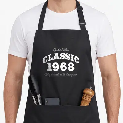
65th car apron - White stacked typography reading Limited Edition Classic 1961 with cursive slogan
US$19.95
Flat US$4.95 US shipping · free over US$65.00 · sales tax is calculated from your shipping address at checkout.
1
US$19.95
Delivery to United States
Arrives —
Orders ship within the United States only. Flat US$4.95 shipping under US$65.00 — free from US$65.00.
Returns
Request a return or exchange within 30 days of purchase, for any reason — we cover return shipping.
Printed to order
Every apron is printed after you order it. Please allow 1-3 business days for processing before it leaves the print shop.
65th Car Apron Featuring 1961 White Typography is printed on a black canvas apron — one size, made to order and shipped within the United States.
65th car apron displays white typography celebrating the year 1961. The phrase They don't make em' like this anymore! lands as a wholesome nod to enduring quality rather than automotive repair. Wearing it puts a sense of pride across the front panel, and those born in that specific year feel it was made for them.
The Artwork Explained
White typography dominates the front panel in a strictly vertical stack of four distinct lines. The top line reads Limited Edition in a delicate cursive script that contrasts sharply with the massive, arched block letters spelling CLASSIC immediately beneath it. The year 1961 appears in heavy serif numerals centered below the main title, anchoring the composition with visual weight. A final sentence at the bottom returns to the flowing script style to deliver the tagline They don't make em' like this anymore!. This arrangement creates a cohesive vintage badge aesthetic using only the color white against the fabric background. The design celebrates the concept of being a classic through typographic hierarchy rather than illustrative imagery, making the wearer feel like a rare and cherished artifact from a bygone era.
Kitchens It Belongs In
Classic car enthusiasts notice the specific year reference immediately upon seeing this garment. It serves as an ideal 65th car apron for a milestone birthday party where guests share stories about vehicles from that decade. Cooks wearing this item signal their appreciation for retro aesthetics while preparing meals in a home filled with vintage memorabilia. The design bridges the gap between automotive hobbyism and domestic life without requiring any pictures of engines or roads. People who value the craftsmanship of the past find this textual tribute more meaningful than generic celebratory patterns.
What Buyers Ask
What are the pocket dimensions? The two front pockets measure exactly 8 by 7 inches each and feature a split down the middle to accommodate hands or tools while maintaining structural integrity during wear. This specific sizing allows for secure storage of small items without the bulk of traditional deep pockets, ensuring the canvas does not sag excessively when empty. The central split also enables the wearer to reach into either pocket independently, offering functional access points that adapt to different tasks in the kitchen or workshop. Does the ink withstand washing? Yes, the white printed text remains durable through standard laundering cycles because the design uses a solid typographic application that resists fading better than photographic prints. Since the artwork consists entirely of uniform letterforms without gradients or fine details, there are no weak points in the print where cracking might initiate during agitation. The opacity of the white ink ensures that even after repeated exposure to water and detergent, the message remains clearly legible and visually striking against the canvas background. Is this about a specific vehicle model? No, the design refers to the birth year 1961 as a vintage status marker, so the wearer identifies with the era's aesthetic rather than a specific automobile manufacturer. The text focuses entirely on the concept of being a classic object or person rather than depicting any mechanical parts or brand logos. This distinction makes the apron accessible to anyone who appreciates the look of the early 1960s, regardless of whether they own, restore, or merely admire cars from that period. The humor relies on the shared cultural understanding of what 1961 represents as a golden age of design and construction.
Every apron is printed after you order it. Orders are processed Monday through Friday, excluding federal holidays — please allow 1-3 business days for order processing. After processing, shipping typically takes 3-7 business days inside the United States, so the total delivery time from order placement is 4-10 business days.
US orders under US$65.00 pay a flat US$4.95 shipping; orders of US$65.00 or more ship free. Bearhap ships within the United States only — we do not ship to international addresses.
You may request a return or exchange within 30 days of the purchase date, for any reason. The apron must be unopened, unused and in its original packaging, with proof of purchase. We refund the item price in full to the original payment method — the original US$4.95 shipping fee is not refundable — and Bearhap covers all return shipping costs: email contact@bearhap.com for a free return label.
Care
Machine wash cold, inside out, with like colours. Tumble dry low or hang to dry. Do not iron directly over the print — press from the back if you need to. No bleach, no dry cleaning.
The ink is water-based and cures into the fabric, so it will soften with the canvas rather than peel off it.
Questions about Car aprons
- Who should buy these automotive-themed bib aprons?
- These aprons suit mechanics, car collectors, and daily drivers who enjoy working on vehicles or simply appreciate automotive culture. They make excellent gifts for fathers, grandfathers, or anyone celebrating a birthday related to their hobby.
- What types of car designs are available?
- The collection includes humorous prints like eating cars, precise detailing themes, OCD-inspired layouts, and milestone age designs for sixty-fifth and sixty-sixth birthdays. There are also options focused on touring and fatherhood within the automotive context.
- How do I choose the right design?
- Select a design based on your role or occasion. Mechanics might prefer precision themes, while those celebrating a birthday should look at the age-specific prints. Consider if you want humor or tribute when picking the print that fits your personality.
You might also like
More car
- 66th car apron
- 73rd car apron
- 81st car apron
- 80s car apron
- 66th cars apron
- 58th cars apron
- 60th cars apron
- 69th cars apron