
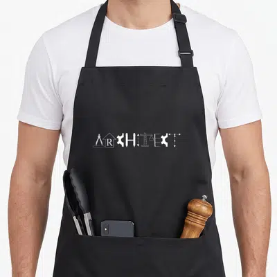

Architect
Architect Birthday Apron Featuring Retro Limited Edition
Architect birthday apron - Retro text ARCHITECT above four red orange yellow and cream stripes with limited edition
US$19.95
Flat US$4.95 US shipping · free over US$65.00 · sales tax is calculated from your shipping address at checkout.
1
US$19.95
Delivery to United States
Arrives —
Orders ship within the United States only. Flat US$4.95 shipping under US$65.00 — free from US$65.00.
Returns
Request a return or exchange within 30 days of purchase, for any reason — we cover return shipping.
Printed to order
Every apron is printed after you order it. Please allow 1-3 business days for processing before it leaves the print shop.
Architect Birthday Apron Featuring Retro Limited Edition is printed on a black canvas apron — one size, made to order and shipped within the United States.
architect birthday apron puts the word ARCHITECT across the front panel, sitting above four horizontal colored stripes with LIMITED EDITION printed on the bottom cream stripe. This design reads as a vintage badge of professional pride rather than a joke. Wearing it celebrates a career built on precision and vision, and this specific style was made for the drafter who values structure over silliness.
The Artwork Explained
The artwork displays bold, cream-colored lettering for the profession name positioned above four distinct horizontal stripes in red, orange, yellow, and cream. The phrase LIMITED EDITION appears in smaller block letters on the final cream stripe at the bottom right, completing the retro composition. This layout mimics a vintage 90s graphic aesthetic without using any cartoon imagery or puns. The combination of distressed textures and warm colors creates a serious yet nostalgic tribute to the trade. The design relies entirely on typography and color blocking to communicate its message, ensuring the focus remains on the profession itself rather than on forced humor or cluttered visuals. Each element serves a structural purpose, building a cohesive visual identity that honors the wearer's specific role in the built environment.
Kitchens It Belongs In
This apron belongs in kitchens where the wearer takes their craft seriously. It serves as a unique birthday gift for the professional who prefers subtle recognition over loud novelty. The product is designed for daily use during meal prep, honoring the wearer's identity as a builder and designer while cooking. Unlike generic kitchen gear, this piece signals a specific appreciation for order, planning, and aesthetic detail. It fits seamlessly into a space where functionality meets personal expression, allowing the user to maintain their professional demeanor even while preparing food. The limited edition label adds a layer of exclusivity that makes the gift feel special and tailored to the individual's taste. It is a practical solution for the architect who does not want to sacrifice style for utility, ensuring they look as sharp in the kitchen as they do at the drawing board. The design respects the intelligence of the wearer, offering a visual cue that aligns with their internal sense of self and professional pride.
What Buyers Ask
Does this apron fit different body types securely? Yes, the waist ties measure 42 inches on each side, providing ample length to tie comfortably in front for various sizes. The main body panel spans 28 inches wide and extends 34 inches long to ensure sufficient coverage for tall users or those needing extra protection while working in the kitchen. These dimensions accommodate a wide range of figures without compromising the integrity of the print or the comfort of the wearer.
Will the ink withstand repeated washing cycles? The print uses durable methods that hold up against laundry, preserving the retro look and legibility of the text. You can wash the item to maintain the crispness of the red, orange, and yellow stripes without worrying about the message fading or peeling away from the fabric surface. This durability ensures the apron remains a viable tool for years of regular use.
Is this design suitable for someone who dislikes jokes? Absolutely, because the artwork relies entirely on typography and color blocks rather than humor or cartoons. The limited edition label and structured layout signal professional status directly, making it appropriate for serious cooks who want to display their job title with dignity. This absence of forced comedy ensures the garment is respected as a genuine representation of their career.
Every apron is printed after you order it. Orders are processed Monday through Friday, excluding federal holidays — please allow 1-3 business days for order processing. After processing, shipping typically takes 3-7 business days inside the United States, so the total delivery time from order placement is 4-10 business days.
US orders under US$65.00 pay a flat US$4.95 shipping; orders of US$65.00 or more ship free. Bearhap ships within the United States only — we do not ship to international addresses.
You may request a return or exchange within 30 days of the purchase date, for any reason. The apron must be unopened, unused and in its original packaging, with proof of purchase. We refund the item price in full to the original payment method — the original US$4.95 shipping fee is not refundable — and Bearhap covers all return shipping costs: email contact@bearhap.com for a free return label.
Care
Machine wash cold, inside out, with like colours. Tumble dry low or hang to dry. Do not iron directly over the print — press from the back if you need to. No bleach, no dry cleaning.
The ink is water-based and cures into the fabric, so it will soften with the canvas rather than peel off it.
Questions about Architect aprons
- Who is the ideal wearer for this collection?
- This collection suits licensed architects, interior designers, and architecture students who want to express their professional identity. It appeals to anyone who appreciates the intersection of artistic vision and structural logic in their daily workflow.
- What specific designs are included here?
- You will find pieces like the ratio golden apron celebrating mathematical proportions and the reaper architect apron referencing deadline pressures. These designs target those who enjoy niche references related to drafting, scaling, and building concepts.
- How do I choose the right one?
- Select based on your current focus, whether it is theoretical study or practical site work. The ratio golden apron fits theorists, while the reaper design suits those facing heavy project loads. Choose the theme that best matches your current professional mood.
You might also like
More architect
- architect graduation student aprons
- definition architect apron
- architecture definition architect apron
- architect square apron
- planner birthday apron
- limited anniversary edition apron
- vintage special birthday apron
- parlay sports betting apron


