

Latina
Bebesota Latin Apron Featuring Retro Stacked Typography
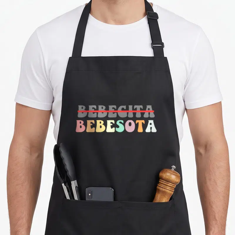
Bebesota latin apron - Stacked text BEBECGITA struck through above colorful BEBESOTA letters
US$19.95
Flat US$4.95 US shipping · free over US$65.00 · sales tax is calculated from your shipping address at checkout.
1
US$19.95
Delivery to United States
Arrives —
Orders ship within the United States only. Flat US$4.95 shipping under US$65.00 — free from US$65.00.
Returns
Request a return or exchange within 30 days of purchase, for any reason — we cover return shipping.
Printed to order
Every apron is printed after you order it. Please allow 1-3 business days for processing before it leaves the print shop.
Bebesota Latin Apron Featuring Retro Stacked Typography is printed on a black canvas apron — one size, made to order and shipped within the United States.
The phrase 'bebesota latin apron' introduces a design featuring the stacked words BEBECGITA and BEBESOTA. A red horizontal line strikes through the top word, signaling that the bottom term is the true identity. This typography-only graphic uses pink, orange, yellow, green, blue, grey, and red to assert cultural pride without humor. Wearing it declares a specific lineage, and those who understand the distinction between the two terms feel seen.
The Artwork Explained
Two lines of bold, rounded text dominate the center of the black bib, creating a striking visual contrast against the dark fabric. The upper word BEBECGITA is rendered in a muted grey tone and is bisected by a sharp red horizontal line that indicates cancellation. Below this rejected label, the word BEBESOTA appears in a vibrant sequence of pink, orange, yellow, green, blue, and red characters. This composition relies entirely on typography and color placement to convey its meaning, avoiding illustrations or icons in favor of pure letterform. The specific arrangement of these six distinct hues gives the design a retro, pastel-heavy aesthetic that stands out clearly on the generous cut of the apron. Ultimately, the visual hierarchy established by the strikethrough forces the viewer to focus exclusively on the colorful bottom word, cementing it as the sole subject of the garment.
Kitchens It Belongs In
This item belongs in kitchens where cultural authenticity is prioritized over generic aesthetics, particularly during family gatherings or heritage-focused cooking sessions. Gifting a 'bebesota latin apron' to someone who values precise identity markers shows deep respect for their specific background rather than a broad stereotype. Home cooks wearing this design signal to guests that they honor their roots through the careful selection of their daily wear. The stark black bib serves as a professional canvas for the bright lettering, making it suitable for both casual meal prep and festive table service. It appeals to users who want their apparel to communicate a factual personal history without relying on jokes or cartoonish imagery.
What Buyers Ask
Does the neck strap fit all adult sizes? Yes, the adjustable neck strap measures 20-30 inches to ensure a secure fit for most adults. This range allows the black bib to sit comfortably at chest level regardless of the wearer's height or build. The generous cut of the apron body further accommodates different torso lengths, preventing the straps from feeling too tight or slipping off shoulders during active use.
Will the colorful letters survive machine washing? The ink is designed to withstand regular laundering while maintaining the vibrancy of the pink, orange, yellow, green, blue, and red hues. Proper care instructions recommend turning the apron inside out before washing to protect the surface of the typography. Avoiding high heat drying helps preserve the elasticity of the fabric and prevents the grey and red accents from fading prematurely over time.
What does the red line through the top word mean? The red horizontal line signifies a rejection of the label BEBECGITA in favor of the term BEBESOTA below it. This visual edit acts as a correction, clarifying that the upper word is incorrect or irrelevant to the wearer's identity. The design uses this simple graphic element to communicate a specific cultural distinction that requires no spoken explanation to be understood by the intended audience.
Every apron is printed after you order it. Orders are processed Monday through Friday, excluding federal holidays — please allow 1-3 business days for order processing. After processing, shipping typically takes 3-7 business days inside the United States, so the total delivery time from order placement is 4-10 business days.
US orders under US$65.00 pay a flat US$4.95 shipping; orders of US$65.00 or more ship free. Bearhap ships within the United States only — we do not ship to international addresses.
You may request a return or exchange within 30 days of the purchase date, for any reason. The apron must be unopened, unused and in its original packaging, with proof of purchase. We refund the item price in full to the original payment method — the original US$4.95 shipping fee is not refundable — and Bearhap covers all return shipping costs: email contact@bearhap.com for a free return label.
Care
Machine wash cold, inside out, with like colours. Tumble dry low or hang to dry. Do not iron directly over the print — press from the back if you need to. No bleach, no dry cleaning.
The ink is water-based and cures into the fabric, so it will soften with the canvas rather than peel off it.
Questions about Latina aprons
- Who is the ideal wearer for these designs?
- These aprons are crafted for Latina women who wish to express their cultural pride and personal strength through fashion. They suit anyone who appreciates the blend of traditional heritage with modern, empowering aesthetics in their daily routine.
- What themes are included in this set?
- The collection features designs referencing lechona traditions, Mexican national pride, and empowering slang like chingona. You will also find styles that highlight individual self-expression and leadership, ensuring there is a unique narrative for every wearer's specific background.
- How do I choose the right design?
- Consider which aspect of your identity resonates most deeply. If you love food culture, select lechona-inspired art. For bold confidence, choose power-themed prints. Each design tells a distinct story about heritage, so pick the one that feels most authentically yours.
You might also like
More latina
- latina latin apron
- latina country apron
- lipstick latin apron
- latina grocery aprons
- bebesota reggaeton apron
- bebesota concert lover apron
- bebesota soy lover apron
- powered arepas apron


