Better Than
Better My Therapy Apron Featuring Girls Trip Typography
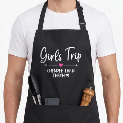
Better my therapy apron - White Girls Trip text above pink arrow with heart and IT'S BETTER THAN THERAPY below
US$19.95
Flat US$4.95 US shipping · free over US$65.00 · sales tax is calculated from your shipping address at checkout.
1
US$19.95
Delivery to United States
Arrives —
Orders ship within the United States only. Flat US$4.95 shipping under US$65.00 — free from US$65.00.
Returns
Request a return or exchange within 30 days of purchase, for any reason — we cover return shipping.
Printed to order
Every apron is printed after you order it. Please allow 1-3 business days for processing before it leaves the print shop.
Better My Therapy Apron Featuring Girls Trip Typography is printed on a black canvas apron — one size, made to order and shipped within the United States.
better my therapy apron puts "Girls Trip" across the front panel in white script, and "IT'S BETTER THAN THERAPY" reads as a declaration that female friendship outshines professional counseling. Wearing it signals that your support system is your primary source of healing, and fellow travelers know this sentiment was written specifically for their group.
Inside The Artwork
This design relies entirely on typography rather than illustrations to make its point. The phrase "Girls Trip" appears in a large, fluid white script at the top, while the second line sits in a simpler, tall font below. A small pink arrow with a heart in the center separates these two main lines of text, adding a singular pop of color to the otherwise white-on-grey composition. The layout stacks the elements vertically to ensure the message is legible from a distance, creating a cohesive picture of solidarity through simple graphic choices.
Who It Speaks To
Sisters and female friends notice the reference to shared experiences first when they see this garment. Gifting this item acknowledges that the recipient values bonding time with her crew above all else. It gets worn in real situations like coordinating outfits for a planned vacation or serving as a fun accessory during a casual weekend getaway with close companions.
Quick Answers
What are the pocket dimensions on this apron? The two front pockets measure exactly 8 x 7 inches each, providing ample space for holding phone or napkins. They are split in the middle to allow for easy access without needing to unzip or unfasten anything, ensuring functionality matches the comfortable 10 oz cotton canvas construction.
How does the ink hold up during cleaning? The white and pink lettering remains durable because the print adheres firmly to the stiff cotton canvas fabric. While the material softens naturally after two or three washes, the ink bonds with the fibers to prevent cracking or fading, maintaining the sharp edges of the script even after repeated laundering.
Does the design imply a specific type of vacation? The specific mention of a "Girls Trip" indicates this is meant for female-centric travel rather than general family holidays. The design targets those organizing getaways with sisters or best friends where the primary goal is emotional connection and shared laughter, distinguishing it from generic travel merchandise.
Every apron is printed after you order it. Orders are processed Monday through Friday, excluding federal holidays — please allow 1-3 business days for order processing. After processing, shipping typically takes 3-7 business days inside the United States, so the total delivery time from order placement is 4-10 business days.
US orders under US$65.00 pay a flat US$4.95 shipping; orders of US$65.00 or more ship free. Bearhap ships within the United States only — we do not ship to international addresses.
You may request a return or exchange within 30 days of the purchase date, for any reason. The apron must be unopened, unused and in its original packaging, with proof of purchase. We refund the item price in full to the original payment method — the original US$4.95 shipping fee is not refundable — and Bearhap covers all return shipping costs: email contact@bearhap.com for a free return label.
Care
Machine wash cold, inside out, with like colours. Tumble dry low or hang to dry. Do not iron directly over the print — press from the back if you need to. No bleach, no dry cleaning.
The ink is water-based and cures into the fabric, so it will soften with the canvas rather than peel off it.
Questions about Better Than aprons
- Who is the primary audience for this specific collection?
- This collection targets individuals who reject standard utilitarian wear in favor of expressive, conversation-starting apparel. It suits professionals, artists, and hobbyists who value humor, cultural heritage, and personal identity in their daily gear, seeking pieces that reflect their unique perspectives and passions beyond mere functionality.
- What types of themes are represented in these designs?
- The designs cover a wide spectrum including social justice, dark humor, athletic passion, rebellion, cultural pride, anime references, religious satire, and kitchen heritage. Each piece uses distinct visual language to connect with specific subcultures and personal interests, ensuring there is a meaningful option for diverse audiences.
- How should I choose the right design from this group?
- Select a design based on your core identity or current interests. If you value social causes, choose the equality piece. For fans of sports, pick the track design. Those appreciating Italian culture may prefer the Sicilian option. Match the visual message to the aspect of your life you wish to highlight most prominently.
You might also like
More better than
- weekend my therapy apron
- trip leopard apron
- better pride apron
- better employee aprons
- trip my therapy apron
- bachelorette my therapy apron
- cheaper my therapy apron
- end my therapy apron