Better Good
Bold Have Better Apron Featuring Good Better Best Typography
Bold have better apron - Stacked GOOD BETTER BEST text in orange and white between two horizontal bars
US$19.95
Flat US$4.95 US shipping · free over US$65.00 · sales tax is calculated from your shipping address at checkout.
1
US$19.95
Delivery to United States
Arrives —
Orders ship within the United States only. Flat US$4.95 shipping under US$65.00 — free from US$65.00.
Returns
Request a return or exchange within 30 days of purchase, for any reason — we cover return shipping.
Printed to order
Every apron is printed after you order it. Please allow 1-3 business days for processing before it leaves the print shop.
Bold Have Better Apron Featuring Good Better Best Typography is printed on a black canvas apron — one size, made to order and shipped within the United States.
The bold have better apron puts the printed words GOOD, BETTER, and BEST across the front panel, and the stacked lettering reads as a declaration of relentless self-improvement. Wearing it signals to everyone nearby that you refuse to settle for average performance, and professional chefs and serious home cooks feel it was crafted specifically for their disciplined approach to food. The design contains no humor or complex imagery, relying instead on the raw power of the three-word progression to communicate its message directly to those who understand the standard it represents.
The Artwork Explained
This design centers entirely on typography arranged in a strict vertical stack between two solid orange horizontal bars. The word GOOD appears in white at the top, followed by BETTER in orange, and BEST in white at the bottom, creating a rhythmic alternation of color and meaning. The layout uses only these specific elements with no additional graphics, textures, or background patterns to distract from the text. The orange and white palette provides high contrast against the natural grey canvas, ensuring the message remains legible even in low-light kitchen environments. This typographic-only composition transforms a simple phrase into a structural element that dominates the chest area without cluttering the visual field.
Kitchens It Belongs In
Professional pastry chefs and line cooks notice the immediate clarity of the message first when wearing this item during service. It functions as a meaningful gift for culinary program graduates or staff members celebrating years of dedicated employment in the industry. The apron withstands the constant motion of hot lines and busy prep stations where visibility and durability are equally important. Its straightforward aesthetic ensures it fits seamlessly into any uniform without competing with other branding or personal style choices.
What Buyers Ask
What are the dimensions of the pockets on this 10 oz cotton canvas model? The pockets measure exactly 8 by 7 inches each, providing ample space for holding essential tools. They are split in the middle to allow longer utensils like tongs or spatulas to rest securely without falling out. This specific sizing accommodates standard kitchen equipment while maintaining the structural integrity of the 10 oz fabric during heavy use.
How does the ink maintain durability through repeated laundering? The print adheres firmly to the 10 oz cotton canvas surface and resists fading or cracking over time. The orange and white pigments bond with the stiff fabric fibers during the printing process, creating a lasting impression that survives standard wash cycles. Users can expect the bold lettering to remain crisp and vibrant well after the initial stiffness of the material has softened through regular wear.
Does this design incorporate any subtle symbols or brand identifiers within the lettering? No hidden symbols or logos exist within this typographic composition; the design consists exclusively of the three stacked words. The visual impact comes solely from the arrangement and color contrast of GOOD, BETTER, and BEST between the two orange bars. This purity of execution means the message stands alone without requiring interpretation of secondary graphic elements or proprietary marks.
Every apron is printed after you order it. Orders are processed Monday through Friday, excluding federal holidays — please allow 1-3 business days for order processing. After processing, shipping typically takes 3-7 business days inside the United States, so the total delivery time from order placement is 4-10 business days.
US orders under US$65.00 pay a flat US$4.95 shipping; orders of US$65.00 or more ship free. Bearhap ships within the United States only — we do not ship to international addresses.
You may request a return or exchange within 30 days of the purchase date, for any reason. The apron must be unopened, unused and in its original packaging, with proof of purchase. We refund the item price in full to the original payment method — the original US$4.95 shipping fee is not refundable — and Bearhap covers all return shipping costs: email contact@bearhap.com for a free return label.
Care
Machine wash cold, inside out, with like colours. Tumble dry low or hang to dry. Do not iron directly over the print — press from the back if you need to. No bleach, no dry cleaning.
The ink is water-based and cures into the fabric, so it will soften with the canvas rather than peel off it.
Questions about Better Good aprons
- Who will best appreciate these designs?
- This collection suits thoughtful individuals who enjoy subtle references to moral growth, pet loyalty, and fictional heroism. It is ideal for those who prefer understated aesthetics over bold statements and value meaningful symbolism in their daily attire.
- What themes are represented here?
- The designs explore themes of canine companionship, anime-inspired perseverance, and general luck. Each pattern connects to broader ideas of striving for improvement and finding joy in simple, repeated actions that build character over time.
- How should I choose one?
- Select based on your primary interest: pet lovers may prefer the doe or left dog designs, while fans of narrative arcs might choose the anime option. Consider which visual style resonates most with your personal interpretation of steady progress and quiet virtue.
You might also like
More better good
- motivational better apron
- rest have better apron
- better clean apron
- rest bear apron
- entrepreneur have better apron
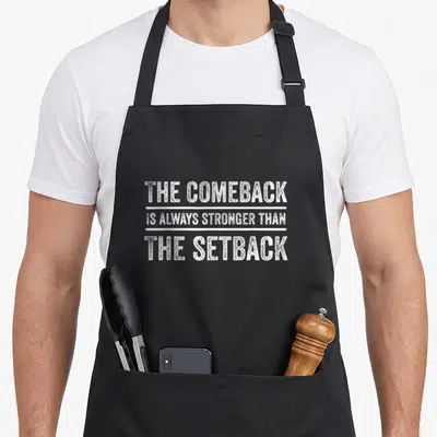
- stronger comeback apron
- stronger motivation apron
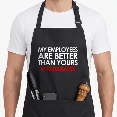
- appreciation employee aprons