Grace
Breast Grace Apron
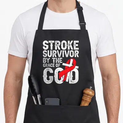
Breast grace apron - Pink ribbon vertical typography design with By The Grace Of God I'm a Survivor text
US$19.95
Flat US$4.95 US shipping · free over US$65.00 · sales tax is calculated from your shipping address at checkout.
1
US$19.95
Delivery to United States
Arrives —
Orders ship within the United States only. Flat US$4.95 shipping under US$65.00 — free from US$65.00.
Returns
Request a return or exchange within 30 days of purchase, for any reason — we cover return shipping.
Printed to order
Every apron is printed after you order it. Please allow 1-3 business days for processing before it leaves the print shop.
Breast Grace Apron is printed on a black canvas apron — one size, made to order and shipped within the United States.
breast grace apron features the phrase BY THE GRACE OF GOD I'm a Survivor BREAST CANCER AWARENESS across the front. The text stacks around a vertical pink ribbon that replaces the letter O in GOD. This declaration reads as a personal testimony of faith and resilience rather than a generic slogan. Wearing it signals to others that the wearer has overcome illness with spiritual strength, and those who have faced breast cancer or support survivors will feel this specific message was made for them.
What The Print Says
The visual design uses a typography-only layout where white and pink ink creates high contrast against the grey background. A large pink awareness ribbon stands vertically down the center, overlapping the word GOD and extending downward to intersect with the script word Survivor. The top line appears in block letters inside a pink rectangle, while the bottom lines combine bold sans-serif and flowing cursive styles to emphasize the personal nature of the statement. This arrangement turns the apron into a canvas for a specific religious and health-related affirmation without using any illustrations or clip art.
The Cook It Was Made For
This product is designed for individuals identifying as breast cancer survivors who wish to display their status in domestic settings. It serves as a conversation starter during family gatherings or community events where the wearer wants to acknowledge their journey openly. Gifting this to a mother, daughter, or friend validates their struggle and celebrates their continued life in everyday environments like the kitchen or workshop.
Ordering Questions
Does the waist tie fit standard sizes? Yes, the waist ties measure 42 inches on each side, providing ample length to tie securely in front for various body shapes. This generous measurement ensures the apron stays fastened comfortably even over bulky clothing or layers commonly worn during active use.
Will the ink withstand repeated washing? The printed design is engineered to maintain its integrity through laundering, keeping the pink and white colors distinct. The typography-only approach minimizes texture issues often found in illustrated prints, resulting in a durable surface that resists fading and cracking over time.
How does the ribbon placement affect the message? The vertical pink ribbon physically connects the words GOD and Survivor, visually reinforcing the idea that faith bridges the gap between diagnosis and recovery. This specific layout makes the statement a unified declaration rather than separate phrases, ensuring the spiritual and personal elements are read as one continuous thought.
Every apron is printed after you order it. Orders are processed Monday through Friday, excluding federal holidays — please allow 1-3 business days for order processing. After processing, shipping typically takes 3-7 business days inside the United States, so the total delivery time from order placement is 4-10 business days.
US orders under US$65.00 pay a flat US$4.95 shipping; orders of US$65.00 or more ship free. Bearhap ships within the United States only — we do not ship to international addresses.
You may request a return or exchange within 30 days of the purchase date, for any reason. The apron must be unopened, unused and in its original packaging, with proof of purchase. We refund the item price in full to the original payment method — the original US$4.95 shipping fee is not refundable — and Bearhap covers all return shipping costs: email contact@bearhap.com for a free return label.
Care
Machine wash cold, inside out, with like colours. Tumble dry low or hang to dry. Do not iron directly over the print — press from the back if you need to. No bleach, no dry cleaning.
The ink is water-based and cures into the fabric, so it will soften with the canvas rather than peel off it.
Questions about Grace aprons
- Who will appreciate this specific design theme?
- Women who value resilience and quiet strength will connect deeply with these designs. The themes focus on endurance, care, and personal growth rather than fleeting trends. It suits mothers, caregivers, and professionals who find meaning in their daily routines and want to wear their values visibly.
- What distinguishes the September Grace design from others?
- The September Grace design specifically utilizes autumnal imagery like falling leaves and harvest tones. It appeals to those who find comfort in seasonal transitions and the concept of letting go. Unlike the more abstract concepts, it grounds the wearer in nature’s predictable, comforting cycles.
- How do I choose between the Project and Kick designs?
- Choose the Project design if you prefer structured, organized aesthetics that reflect planning and order. Select the Kick design if you want something more dynamic and energetic, featuring bold shapes that suggest action and forward momentum. Your choice should match your current lifestyle pace.
You might also like
More grace
- survivor grace apron
- christian grace apron
- stroke grace apron
- god grace apron
- faith breast cancer awareness aprons
- breast christian apron
- cure breast cancer awareness aprons
- touched breast cancer awareness aprons