Cereal
Cereal Family Aprons Cereal KILLER Typography Design
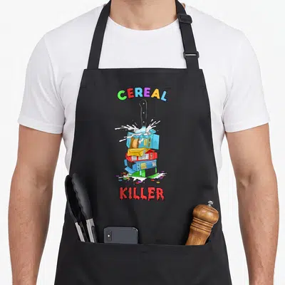
Cereal family aprons - Cereal KILLER text with red spoon and yellow loop in red blue yellow white
US$19.95
Flat US$4.95 US shipping · free over US$65.00 · sales tax is calculated from your shipping address at checkout.
1
US$19.95
Delivery to United States
Arrives —
Orders ship within the United States only. Flat US$4.95 shipping under US$65.00 — free from US$65.00.
Returns
Request a return or exchange within 30 days of purchase, for any reason — we cover return shipping.
Printed to order
Every apron is printed after you order it. Please allow 1-3 business days for processing before it leaves the print shop.
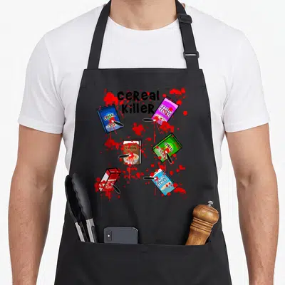
Cereal Family Aprons Cereal KILLER Typography Design is printed on a black canvas apron — one size, made to order and shipped within the United States.
cereal family aprons puts the phrase Cereal KILLER across the front panel, where the letter K integrates a red spoon and yellow cereal loop. This pun reads as a playful tribute to those who eat breakfast grain for every meal. Wearing it signals that you have no shame about your morning ritual, and this design was made specifically for people who treat cereal as a lifestyle rather than just a food.
What You Are Looking At
The artwork consists entirely of stacked text in a bold, blocky style using red, yellow, blue, and white colors. A red spoon handle forms the stem of the letter K in the bottom line, while a small yellow cereal loop sits within the same character structure. The layout places Cereal above KILLER without any background imagery or borders. This typography-only approach mimics vintage packaging aesthetics to deliver a pun that lands as lighthearted humor. The visual arrangement ties the utensil and food item directly into the word itself, creating a cohesive graphic that relies solely on color and shape to communicate its message.
The Right Person For It
This cereal family aprons appeals to anyone whose hobby involves eating boxed grains at any hour of the day. It functions as a perfect gift for birthdays or holidays for relatives who confess to eating cereal for supper. The wearer uses this garment during actual cooking or simply while posing proudly with a bowl. The design celebrates the specific subculture of cereal enthusiasts who view their preference as a defining personality trait rather than a childhood habit.
Details Worth Asking About
Does the 8 x 7 inch split pocket fit standard bowls? Yes, the two front pockets measure 8 x 7 inches each and are split in the middle to accommodate tall mugs or bowls safely. This structural detail allows users to hold serving ware securely without needing to balance items against their torso, making the storage space functional for active kitchen use rather than just decorative. How does the ink hold up after repeated washes? The printed design remains durable because the vibrant red, yellow, blue, and white colors are applied directly to the sturdy 10 oz cotton canvas fabric. This material density prevents the ink from cracking or fading prematurely, ensuring the typography stays crisp and the spoon illustration retains its definition through multiple cleaning cycles. Why is the spoon inside the letter K significant? The red spoon is physically integrated into the structure of the K rather than placed beside it, which visually connects the act of eating to the word itself. This specific design choice turns the typography into an illustration of the pun, distinguishing it from generic text-based aprons by making the utensil a literal building block of the message.
Every apron is printed after you order it. Orders are processed Monday through Friday, excluding federal holidays — please allow 1-3 business days for order processing. After processing, shipping typically takes 3-7 business days inside the United States, so the total delivery time from order placement is 4-10 business days.
US orders under US$65.00 pay a flat US$4.95 shipping; orders of US$65.00 or more ship free. Bearhap ships within the United States only — we do not ship to international addresses.
You may request a return or exchange within 30 days of the purchase date, for any reason. The apron must be unopened, unused and in its original packaging, with proof of purchase. We refund the item price in full to the original payment method — the original US$4.95 shipping fee is not refundable — and Bearhap covers all return shipping costs: email contact@bearhap.com for a free return label.
Care
Machine wash cold, inside out, with like colours. Tumble dry low or hang to dry. Do not iron directly over the print — press from the back if you need to. No bleach, no dry cleaning.
The ink is water-based and cures into the fabric, so it will soften with the canvas rather than peel off it.
Questions about Cereal aprons
- Who is the ideal recipient for this collection?
- This collection suits anyone who loves breakfast culture, vintage packaging aesthetics, or pop culture references. It is made for friends who enjoy humorous gifts, parents looking for fun kitchen wear, or collectors of quirky home goods. The designs cater to diverse tastes within the cereal enthusiast community.
- What makes these designs unique compared to other collections?
- Each print tells a specific story, from socialist commentary on cereal boxes to horror-inspired mascot imagery. Unlike generic food patterns, these designs reference niche cultural moments, such as Torgo from Heavy Metal or Reptar from Rugrats. This specificity ensures the wearer feels understood by those who recognize the subtle nods to media history.
- How do I choose the right design for my style?
- Consider your favorite childhood shows or movies when selecting a print. If you prefer satire, the socialism box apron works well. For nostalgia, try the cereal family or reptar designs. Those drawn to darker humor might select the killer cereal option. Match the theme to your personal interests for maximum enjoyment.
You might also like
More cereal
- cereal breakfast apron
- killer food aprons
- cereal box apron
- funny cereal breakfast apron
- cereal food aprons
- serial cereal apron
- cereal halloween apron
- aisle cereal apron