Oregon
Funny Oregon Portland Apron Featuring Distressed Yellow Text
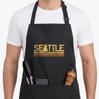
Funny oregon portland apron - Distressed yellow PORTLAND text with pine tree in L and two orange lines below
US$19.95
Flat US$4.95 US shipping · free over US$65.00 · sales tax is calculated from your shipping address at checkout.
1
US$19.95
Delivery to United States
Arrives —
Orders ship within the United States only. Flat US$4.95 shipping under US$65.00 — free from US$65.00.
Returns
Request a return or exchange within 30 days of purchase, for any reason — we cover return shipping.
Printed to order
Every apron is printed after you order it. Please allow 1-3 business days for processing before it leaves the print shop.
Funny Oregon Portland Apron Featuring Distressed Yellow Text is printed on a black canvas apron — one size, made to order and shipped within the United States.
The funny oregon portland apron puts the word PORTLAND across the front panel in a distressed yellow font, and the typography reads as a tribute to regional heritage rather than a gag. A pine tree shape integrates into the letter L, and two orange horizontal lines anchor the design below the text. Wearing this item signals appreciation for vintage aesthetics and local identity, and people who live in or love the Pacific Northwest feel this specific graphic was made for them.
Reading The Design
The central focus of this artwork is the word PORTLAND rendered in a bold, weathered yellow typeface that occupies the middle of the black bib. The letter L functions as a container for a simple pine tree silhouette, replacing the vertical stem with a triangular evergreen form. Below the main text, two distinct orange horizontal lines run parallel to each other, adding a secondary color accent to the yellow primary. The distressed texture applied to all elements gives the impression of age and wear, mimicking the look of screen-printed vintage merchandise. This combination of text, nature symbol, and linear geometry creates a cohesive retro emblem that belongs to the category of classic city graphics.
When People Wear It
People from Portland or the surrounding Oregon region notice the specific integration of the pine tree into the lettering first. This funny oregon portland apron works well as a gift for loved ones who enjoy visiting the city or want a souvenir that feels authentic and unpretentious. The everyday situation for this garment is practical kitchen work or outdoor crafting, where the black fabric hides stains while the bright yellow and orange print remains visible. It suits environments where a serious dedication to the location is preferred over slapstick comedy or loud slogans.
Common Questions
What is the neck strap length for this black bib apron? The adjustable neck strap measures between 20 and 30 inches to fit most adults comfortably. This specific range allows the generous cut of the black bib to hang correctly without being too tight or too loose around the neck. Users can modify the length before putting the apron on to ensure the printed design stays centered on the chest regardless of their height or build.
How does the distressed ink withstand repeated washing cycles? The ink durability relies on the solid block coverage of the distressed yellow and orange colors rather than fine detail lines. Because the design consists of large, filled shapes with intentional texture gaps, minor fading blends seamlessly with the existing weathered aesthetic. The print adheres to the black fabric surface in a way that maintains the retro look even after multiple washes, ensuring the artifact never appears damaged or poorly maintained.
Why does the letter L contain a pine tree shape? The pine tree replaces the vertical stroke of the L to visually connect the city name with the natural environment of the Pacific Northwest. This specific graphic choice distinguishes the design from standard text logos by embedding a regional symbol directly into the typography. The triangular shape fits perfectly within the negative space of the letter structure, creating a unified emblem that represents both the location and its iconic flora in a single element.
Every apron is printed after you order it. Orders are processed Monday through Friday, excluding federal holidays — please allow 1-3 business days for order processing. After processing, shipping typically takes 3-7 business days inside the United States, so the total delivery time from order placement is 4-10 business days.
US orders under US$65.00 pay a flat US$4.95 shipping; orders of US$65.00 or more ship free. Bearhap ships within the United States only — we do not ship to international addresses.
You may request a return or exchange within 30 days of the purchase date, for any reason. The apron must be unopened, unused and in its original packaging, with proof of purchase. We refund the item price in full to the original payment method — the original US$4.95 shipping fee is not refundable — and Bearhap covers all return shipping costs: email contact@bearhap.com for a free return label.
Care
Machine wash cold, inside out, with like colours. Tumble dry low or hang to dry. Do not iron directly over the print — press from the back if you need to. No bleach, no dry cleaning.
The ink is water-based and cures into the fabric, so it will soften with the canvas rather than peel off it.
Questions about Oregon aprons
- Who is the primary audience for these Oregon-themed designs?
- These designs target Oregon residents, alumni, and visitors who appreciate the state's natural beauty and cultural quirks. They suit anyone looking for apparel that reflects local pride without being overly loud or generic.
- What specific motifs are included in this set?
- The set includes motifs ranging from bigfoot legends and forest trees to football huddles and Portland cityscapes. Each design captures a distinct aspect of regional identity, from outdoor adventures to urban lifestyle elements.
- How do I choose the right design for my needs?
- Select based on your personal connection to the theme. Choose the bigfoot design for humor, the tree motif for nature lovers, or the Portland icon for city dwellers. Consider whether you prefer subtle distressing or bold graphics for your work environment.
You might also like
More oregon
- oregon portland apron
- portland 70s apron
- oregon apron or apron
- souvenir portland apron
- cute oregon portland apron
- oregon 70s apron
- funny washington seattle apron
- funny maine apron