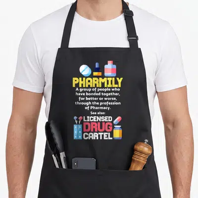
Pharmacist
Future Pharmacist Apron Featuring Stacked Black Typography
Future pharmacist apron - Stacked black text reading Future Pharmacist in mixed block and script fonts
US$19.95
Flat US$4.95 US shipping · free over US$65.00 · sales tax is calculated from your shipping address at checkout.
1
US$19.95
Delivery to United States
Arrives —
Orders ship within the United States only. Flat US$4.95 shipping under US$65.00 — free from US$65.00.
Returns
Request a return or exchange within 30 days of purchase, for any reason — we cover return shipping.
Printed to order
Every apron is printed after you order it. Please allow 1-3 business days for processing before it leaves the print shop.
Future Pharmacist Apron Featuring Stacked Black Typography is printed on a black canvas apron — one size, made to order and shipped within the United States.
The phrase future pharmacist puts the words FUTURE and Pharmacist across the front panel in a stacked arrangement. The text reads as a confident declaration of career trajectory rather than a humorous quip. Wearing it establishes professional identity during lab work and clinical rotations, and pharmacy students who have spent years studying recognize this design as a mirror of their own dedication.
What The Print Says
This design focuses exclusively on typography with no background patterns or illustrative elements. The word FUTURE appears in a bold, blocky sans-serif font sitting directly above the word Pharmacist. The lower word transitions into a loose, handwritten script style that contrasts with the rigid geometry above. Both lines are rendered in solid black ink. This two-line layout creates a balanced composition that draws the eye vertically through the message. The stark difference in font weight emphasizes the transition from the abstract concept of the future to the concrete reality of the profession. No other colors or shapes distract from this simple, powerful statement about professional identity.
The Cook It Was Made For
Pharmacy students and aspiring pharmacists notice the clean, uncluttered lettering as a symbol of their academic progress. This future pharmacist apron makes a meaningful gift for graduates stepping into their first roles. It is specifically suited for everyday wear in hospital pharmacies, retail stores, and university laboratories. The design communicates readiness and competence without requiring loud graphics or slogans. It belongs in spaces where accuracy and professionalism are the highest priorities.
Ordering Questions
Does the apron fit different body sizes? The body measures 28 inches wide by 34 inches long to accommodate various builds. This dimension provides sufficient coverage for the midsection while allowing freedom of movement. The generous width prevents the print from being cut off at the sides during reach or bending motions common in pharmacy work.
Can I wash this apron frequently? The black ink is applied to endure repeated laundering and high-heat drying. Standard washing routines will not cause the lettering to peel or fade significantly. This durability is essential for maintaining hygiene standards in medical and educational environments where frequent cleaning is mandatory.
What makes this font selection distinct? The combination of a rigid block font and a fluid script reflects the dual demands of the field. Science requires structure while patient interaction requires empathy. This specific pairing of typography styles visually represents that balance in a way that plain text cannot. It elevates the design beyond a simple label into a subtle representation of professional values.
Every apron is printed after you order it. Orders are processed Monday through Friday, excluding federal holidays — please allow 1-3 business days for order processing. After processing, shipping typically takes 3-7 business days inside the United States, so the total delivery time from order placement is 4-10 business days.
US orders under US$65.00 pay a flat US$4.95 shipping; orders of US$65.00 or more ship free. Bearhap ships within the United States only — we do not ship to international addresses.
You may request a return or exchange within 30 days of the purchase date, for any reason. The apron must be unopened, unused and in its original packaging, with proof of purchase. We refund the item price in full to the original payment method — the original US$4.95 shipping fee is not refundable — and Bearhap covers all return shipping costs: email contact@bearhap.com for a free return label.
Care
Machine wash cold, inside out, with like colours. Tumble dry low or hang to dry. Do not iron directly over the print — press from the back if you need to. No bleach, no dry cleaning.
The ink is water-based and cures into the fabric, so it will soften with the canvas rather than peel off it.
Questions about Pharmacist aprons
- Who is the ideal wearer for these pharmacy-themed prints?
- These designs suit licensed pharmacists, pharmacy technicians, and students entering the field. They appeal to anyone working in community or hospital settings who wants to express their professional pride. The variety of themes ensures there is a matching option for different roles and personalities within the pharmacy team.
- What specific elements do the designs highlight about the job?
- The artwork emphasizes key aspects like medical knowledge, attention to detail, and patient care. Themes such as brains and roses reflect intelligence and compassion. Graphics related to fixing problems or school settings acknowledge the educational and technical challenges inherent in dispensing medications safely every day.
- How should I choose the right design from this group?
- Select based on your primary role and personal style. Technicians might prefer functional graphics like the fix theme, while pharmacists may choose brain motifs for expertise. Consider whether you want humor or elegance. Match the design to how you view your contribution to patient health and daily workflow in the pharmacy setting.
You might also like
More pharmacist
- certified pharmacist apron
- pharmacy technician pharmacist apron
- assistant pharmacist apron
- educated pharmacist apron
- future physician student aprons
- future midwife apron
- future doctor apron
- future e.a apron