Bowie
Grateful David Aprons Featuring Station to Station
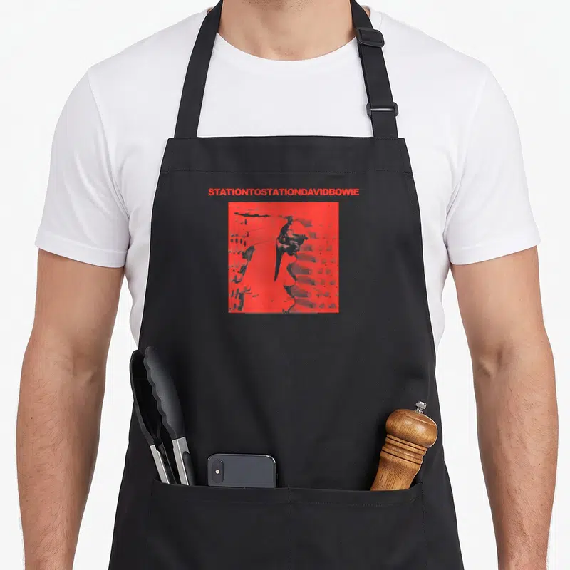
Grateful david aprons - Red text STATIONTOSTATIONDAVIDBOWIE above red square with high-contrast man silhouette
US$19.95
Flat US$4.95 US shipping · free over US$65.00 · sales tax is calculated from your shipping address at checkout.
1
US$19.95
Delivery to United States
Arrives —
Orders ship within the United States only. Flat US$4.95 shipping under US$65.00 — free from US$65.00.
Returns
Request a return or exchange within 30 days of purchase, for any reason — we cover return shipping.
Printed to order
Every apron is printed after you order it. Please allow 1-3 business days for processing before it leaves the print shop.
Grateful David Aprons Featuring Station to Station is printed on a black canvas apron — one size, made to order and shipped within the United States.
grateful david aprons displays the phrase STATIONTOSTATIONDAVIDBOWIE in a single red line above a red square containing a high-contrast silhouette of a man. This layout references the 1976 album cover and uses a minimalist aesthetic with no humor or extra graphics. Wearing it puts your musical taste across the front panel, and fans of 1970s art rock recognize this specific visual language immediately.
The Design Itself
A single line of red text reading STATIONTOSTATIONDAVIDBOWIE sits centered at the very top of the front panel. Below this typography is a red square that contains a high-contrast silhouette of a man rendered in a minimalist style. The entire composition uses only the color red against the fabric background to create a striking two-tone effect. This specific arrangement belongs to the visual model of 1970s album artwork and avoids any humorous embellishments. The design functions as a cohesive unit where the heavy text balances the weight of the central graphic block.
Occasions It Fits
Art rock enthusiasts notice the specific typographic spacing and the singular use of red before they read the words. This grateful david aprons makes a thoughtful gift for anyone who collects memorabilia from the mid-seventies era. It gets worn in everyday situations like cooking or workshop projects where a durable, visually distinct covering is needed. The lack of humor or clutter makes it suitable for serious display alongside other collectibles.
Things People Ask
What are the measurements for the waist ties and body size? The waist ties measure 42 inches on each side and are long enough to tie securely in front. The body size is 28 inches wide by 34 inches long, ensuring sufficient coverage for most users. These dimensions provide a generous fit that accommodates various body types without restricting movement.
How does the ink hold up during washing? The print remains durable through standard laundering because it is integrated into the fabric structure. High-contrast designs like this red silhouette tend to withstand friction better than fine-line illustrations. Follow standard care instructions to maintain the vibrancy of the red color over time.
What does the text on the apron actually say? The text reads STATIONTOSTATIONDAVIDBOWIE as one continuous string of uppercase letters without spaces. This specific formatting is a key part of the original artwork's identity and distinguishes it from other merchandise. Reading it requires recognizing the concatenation of the album title and the artist name within the single line.
Every apron is printed after you order it. Orders are processed Monday through Friday, excluding federal holidays — please allow 1-3 business days for order processing. After processing, shipping typically takes 3-7 business days inside the United States, so the total delivery time from order placement is 4-10 business days.
US orders under US$65.00 pay a flat US$4.95 shipping; orders of US$65.00 or more ship free. Bearhap ships within the United States only — we do not ship to international addresses.
You may request a return or exchange within 30 days of the purchase date, for any reason. The apron must be unopened, unused and in its original packaging, with proof of purchase. We refund the item price in full to the original payment method — the original US$4.95 shipping fee is not refundable — and Bearhap covers all return shipping costs: email contact@bearhap.com for a free return label.
Care
Machine wash cold, inside out, with like colours. Tumble dry low or hang to dry. Do not iron directly over the print — press from the back if you need to. No bleach, no dry cleaning.
The ink is water-based and cures into the fabric, so it will soften with the canvas rather than peel off it.
Questions about Bowie aprons
- Who is the ideal buyer for these designs?
- These pieces suit devoted music fans who grew up with glam rock and new wave. They also appeal to younger listeners discovering his legacy through modern covers. Anyone who values self-expression through clothing and wants to show off their favorite artist will feel connected to this lineup.
- What makes these prints special compared to other merch?
- The prints focus on specific visual motifs rather than just logos. We use artistic interpretations of his stage personas like the Starman character. This approach creates a more subtle and smart look that works well in casual settings while still signaling your deep appreciation for his work.
- How should I choose between the different styles?
- Consider which era of his career you connect with most. Choose lightning designs if you love his high-energy concert persona. Opt for prettier styles if you prefer his more introspective album artwork. Matching the print to your personal memory of him ensures the apron feels like a genuine tribute.
You might also like
More bowie
- station david aprons
- funny bowie david aprons
- festive david aprons
- cute bowie david aprons
- husband christmas apron
- grateful blessed thankful apron
- funny grateful thankful apron
- cute grateful apron