Dirty
Hand the Dirty Apron with Hand Sanitizer Pump 10-15 Times Then Rub
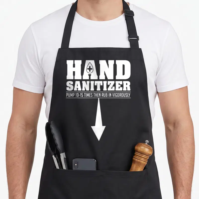
Hand the dirty apron - White text reading hand sanitizer pump 10-15 times then rub in vigorously with a downward arrow
US$19.95
Flat US$4.95 US shipping · free over US$65.00 · sales tax is calculated from your shipping address at checkout.
1
US$19.95
Delivery to United States
Arrives —
Orders ship within the United States only. Flat US$4.95 shipping under US$65.00 — free from US$65.00.
Returns
Request a return or exchange within 30 days of purchase, for any reason — we cover return shipping.
Printed to order
Every apron is printed after you order it. Please allow 1-3 business days for processing before it leaves the print shop.
Hand the Dirty Apron with Hand Sanitizer Pump 10-15 Times Then Rub is printed on a black canvas apron — one size, made to order and shipped within the United States.
hand the dirty apron features the phrase HAND SANITIZER PUMP 10-15 TIMES THEN RUB IN VIGOROUSLY printed in white. The text reads as a sarcastic instruction manual rather than a recipe, mocking the excessive use of cleaning products. Wearing it signals that you take hygiene seriously but appreciate the humor in the obsession. This design was made specifically for kitchen staff and home cooks who find themselves over-sanitizing.
The Artwork Explained
Three lines of white text stack vertically across the chest panel to create a bold typographic statement. A droplet shape containing a medical cross replaces the standard dot within the letter A of the first word. A large white arrow extends downward from the final line, directing attention below the waist. The entire composition relies on high-contrast white ink against the fabric background to mimic the appearance of an instructional label. This layout transforms a mundane safety warning into a piece of visual commentary on modern hygiene habits.
Kitchens It Belongs In
Commercial kitchen workers notice the specific phrasing immediately because it mirrors real-world safety signage they encounter daily. Gifting this to a parent or partner works well for birthdays or holidays when they appreciate dark humor about domestic routines. The apron gets worn most often during active meal preparation when hands are frequently washed and sanitized between tasks.
What Buyers Ask
Does the apron have pockets to hold tools? Yes, this apron has two front pockets that measure 8 x 7 inches each. They are split in the middle to accommodate different tool sizes securely. This structural detail ensures your scissors or towels stay accessible while the design remains visible above them.
Can I wash this without ruining the print? The white ink is durable enough to withstand repeated laundering without fading or cracking. You should wash it cold and dry it low to preserve the stiffness of the 10 oz cotton canvas. Following these simple care steps keeps the text crisp and legible through many cooking sessions.
What does the arrow pointing down actually mean? The arrow directs the viewer's gaze downward, implying the action continues below the frame or suggesting where the product is located. It visually reinforces the command to pump the bottle by indicating a vertical motion. This graphic element turns static text into a directional instruction typical of dispenser labels.
Every apron is printed after you order it. Orders are processed Monday through Friday, excluding federal holidays — please allow 1-3 business days for order processing. After processing, shipping typically takes 3-7 business days inside the United States, so the total delivery time from order placement is 4-10 business days.
US orders under US$65.00 pay a flat US$4.95 shipping; orders of US$65.00 or more ship free. Bearhap ships within the United States only — we do not ship to international addresses.
You may request a return or exchange within 30 days of the purchase date, for any reason. The apron must be unopened, unused and in its original packaging, with proof of purchase. We refund the item price in full to the original payment method — the original US$4.95 shipping fee is not refundable — and Bearhap covers all return shipping costs: email contact@bearhap.com for a free return label.
Care
Machine wash cold, inside out, with like colours. Tumble dry low or hang to dry. Do not iron directly over the print — press from the back if you need to. No bleach, no dry cleaning.
The ink is water-based and cures into the fabric, so it will soften with the canvas rather than peel off it.
Questions about Dirty aprons
- Who is the ideal buyer for this themed collection?
- This collection suits experienced chefs and kitchen staff who enjoy dark humor. It resonates with professionals who view the mess of cooking as an integral part of their identity and pride in their craft rather than something to hide.
- What specific designs are included in this set?
- The set includes stop the dirty apron, poison the dirty apron, thirty the dirty apron, stink the dirty apron, meat the dirty apron, and naughty the dirty apron. Each design uses distinct typography and imagery to convey specific aspects of kitchen life.
- How should one choose the right design from this group?
- Select based on your personal attitude toward kitchen work. Choose stink the dirty apron for raw honesty, meat the dirty apron for ingredient focus, or naughty the dirty apron for rebellious flair. Match the graphic tone to your team culture and personal style preferences.
You might also like
More dirty
- safe the dirty apron
- innuendo the dirty apron
- thirty the dirty apron
- sexual the dirty apron
- socially humorous aprons
- crew housekeeper apron
- sanitizer halloween apron
- smell offensive aprons