South Africa
Johannesburg 1980s Apron Featuring Distressed JOHANNESBURG
Johannesburg 1980s apron - Distressed JOHANNESBURG text over four red orange and blue stripes with SOUTH AFRICA label
US$19.95
Flat US$4.95 US shipping · free over US$65.00 · sales tax is calculated from your shipping address at checkout.
1
US$19.95
Delivery to United States
Arrives —
Orders ship within the United States only. Flat US$4.95 shipping under US$65.00 — free from US$65.00.
Returns
Request a return or exchange within 30 days of purchase, for any reason — we cover return shipping.
Printed to order
Every apron is printed after you order it. Please allow 1-3 business days for processing before it leaves the print shop.
Johannesburg 1980s Apron Featuring Distressed JOHANNESBURG is printed on a black canvas apron — one size, made to order and shipped within the United States.
johannesburg 1980s apron puts the word JOHANNESBURG in large, distressed black letters across the upper front panel, followed by four horizontal stripes in red, orange, light blue, and dark blue. SOUTH AFRICA overlaps the bottom right corner of the last stripe, creating a cohesive retro travel graphic that reads as a vintage souvenir. Wearing it offers a durable layer of protection against spills while showcasing appreciation for the city, and travelers or residents who want functional gear with a nostalgic aesthetic feel it was made for them.
Inside The Artwork
The artwork centers on the bold, textured typography of JOHANNESBURG which dominates the upper half of the design. Four distinct colored stripes run horizontally beneath the main text, featuring shades of red, orange, light blue, and dark blue in a stacked arrangement. The phrase SOUTH AFRICA sits at the bottom right, partially overlapping the lowest dark blue stripe to complete the composition. Every element carries a distressed finish that mimics age and wear rather than depicting actual damage or decay. This visual style anchors the piece in a specific vintage era without relying on humor or cartoonish elements. The combination of the heavy lettering and the linear color blocks creates a structured, geometric look that feels like a classic travel poster reimagined for kitchen use.
Who It Speaks To
This design speaks directly to travelers who have experienced Johannesburg or expats maintaining a connection to the country. It functions as a meaningful gift for someone returning from a trip or planning a visit to South Africa. The product is a johannesburg 1980s apron that balances sentimental value with practical utility in everyday cooking or workshop scenarios. People who prefer straightforward graphics over jokes find this layout appealing because it focuses entirely on place and color. It is an ideal item for anyone wanting to display pride in a specific location while keeping their clothes safe during messy tasks.
Quick Answers
Do the pockets offer enough space for tools? Yes, the two front pockets provide ample storage with each measuring exactly 8 by 7 inches. They are split in the middle to create separate compartments for organizing small items. This specific dimension ensures you can carry essentials without the pockets sagging excessively under weight. The generous size makes them highly functional for holding utensils or rags during active use in the kitchen or garage. Will the printed design survive repeated laundering? The ink durability is built into the distressed aesthetic, meaning the worn look is part of the original print rather than fading caused by washing. The design uses a stable application method that resists cracking or peeling when cleaned regularly. You can maintain the vintage appearance indefinitely because the texture is intentional and permanent. Standard washing routines will not degrade the clarity of the colored stripes or the legibility of the text. Is there any hidden symbolism in the colored stripes? No, the design uses the four colors strictly for visual balance and retro styling without implying specific meanings or logos. The arrangement of red, orange, light blue, and dark blue follows a simple geometric pattern typical of vintage graphic design. There are no additional icons or hidden messages within the colored bands. The focus remains entirely on the typographic presentation of the city name and the straightforward color palette.
Every apron is printed after you order it. Orders are processed Monday through Friday, excluding federal holidays — please allow 1-3 business days for order processing. After processing, shipping typically takes 3-7 business days inside the United States, so the total delivery time from order placement is 4-10 business days.
US orders under US$65.00 pay a flat US$4.95 shipping; orders of US$65.00 or more ship free. Bearhap ships within the United States only — we do not ship to international addresses.
You may request a return or exchange within 30 days of the purchase date, for any reason. The apron must be unopened, unused and in its original packaging, with proof of purchase. We refund the item price in full to the original payment method — the original US$4.95 shipping fee is not refundable — and Bearhap covers all return shipping costs: email contact@bearhap.com for a free return label.
Care
Machine wash cold, inside out, with like colours. Tumble dry low or hang to dry. Do not iron directly over the print — press from the back if you need to. No bleach, no dry cleaning.
The ink is water-based and cures into the fabric, so it will soften with the canvas rather than peel off it.
Questions about South Africa aprons
- Who is the ideal buyer for these items?
- These items suit individuals who take pride in their South African heritage or support local rugby teams. They are made for home cooks who want to display national symbols or sports fans looking for unique apparel that reflects their personal identity and cultural connections during daily activities.
- What specific themes are included here?
- The collection features rugby motifs, national flags, and historical references. Designs include Bokke imagery, American flag blends, and bright color schemes representing the country. Each theme is carefully selected to resonate with local pride and international appreciation for South African culture and sports traditions.
- How should I choose the right design?
- Select based on your primary interest. Choose the rugby option if you support the national team. Pick the flag version for general patriotism. Opt for the unique blend if you appreciate cross-cultural symbols. Consider the color intensity and specific iconography that best represents your personal style and values.
You might also like
More south africa
- africa south african apron
- funny south africa apron
- funny africa south african apron
- africa flag south african apron
- cute africa south african apron
- ghana african apron
- africa african apron
- continent african apron


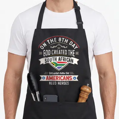
Cute Africa South African Apron
US$19.95