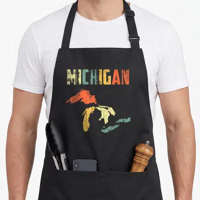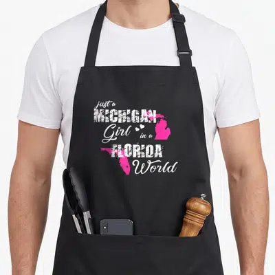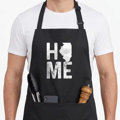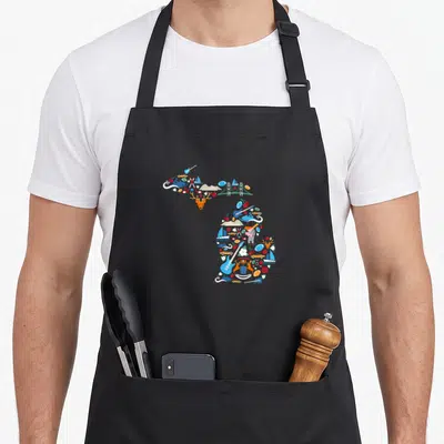

Michigan Pride
Map Pride Apron Featuring Distressed White LOVE Text
Map pride apron - Distressed white LOVE text with Michigan map replacing the letter O
US$19.95
Flat US$4.95 US shipping · free over US$65.00 · sales tax is calculated from your shipping address at checkout.
1
US$19.95
Delivery to United States
Arrives —
Orders ship within the United States only. Flat US$4.95 shipping under US$65.00 — free from US$65.00.
Returns
Request a return or exchange within 30 days of purchase, for any reason — we cover return shipping.
Printed to order
Every apron is printed after you order it. Please allow 1-3 business days for processing before it leaves the print shop.
Map Pride Apron Featuring Distressed White LOVE Text is printed on a black canvas apron — one size, made to order and shipped within the United States.
The map pride apron puts the word LOVE across the front panel in a structured 2x2 grid, and the top right quadrant reads as a precise outline of the Michigan state boundary. This distressed white text layout replaces a standard character with geography to signal deep regional affection. Wearing it protects clothing from splatters while projecting a sense of belonging to the Great Lakes region, and residents who identify as true midwesterners feel this design was made specifically for them.
What The Print Says
The central graphic arranges four characters in a square formation, with the letters L, V, and E rendered in a heavy, blocky font that shows signs of wear through a distressed white finish. The fourth element in the top right position is not a letter but a solid white map of Michigan, maintaining the same height and visual weight as the surrounding text. This artistic choice creates a unified image where the state itself becomes the object of affection implied by the remaining letters. The layout belongs to a category of regional pride graphics that favor symbolic substitution over literal representation, grounding the concept of love in a specific physical location.
The Cook It Was Made For
Home cooks who prioritize local identity choose this apron because the graphic communicates a specific cultural alignment that generic patterns cannot match. It functions as an ideal birthday or Christmas gift for siblings, parents, or relatives who express their personality through state loyalty rather than traditional holiday motifs. The wearer notices the clever typographic substitution immediately, recognizing it as a signature of the wolverine state. This product is worn in everyday kitchens where the cook wants to display their heritage without shouting, making it suitable for both daily meal prep and festive gatherings.
Ordering Questions
What are the exact dimensions of the waist ties and body size? The body measures 28 inches wide by 34 inches long to cover the torso adequately, and each waist tie extends 42 inches on both sides. This extra length ensures the straps can be tied securely in the front for users of varying widths without leaving loose ends hanging down. Does the distressed ink texture wash out or fade quickly? The white distressed print is designed to withstand washing cycles while retaining its intended vintage aesthetic. The texture is part of the design intent, so minor fading blends seamlessly with the weathered look rather than appearing as damage or wear. Why is the map shape used instead of a standard letter? The map replaces the letter O to visually merge the concept of love with the specific geography of Michigan. This substitution transforms a common word into a localized statement, ensuring the design speaks directly to people who associate the word love with this particular state boundary.
Every apron is printed after you order it. Orders are processed Monday through Friday, excluding federal holidays — please allow 1-3 business days for order processing. After processing, shipping typically takes 3-7 business days inside the United States, so the total delivery time from order placement is 4-10 business days.
US orders under US$65.00 pay a flat US$4.95 shipping; orders of US$65.00 or more ship free. Bearhap ships within the United States only — we do not ship to international addresses.
You may request a return or exchange within 30 days of the purchase date, for any reason. The apron must be unopened, unused and in its original packaging, with proof of purchase. We refund the item price in full to the original payment method — the original US$4.95 shipping fee is not refundable — and Bearhap covers all return shipping costs: email contact@bearhap.com for a free return label.
Care
Machine wash cold, inside out, with like colours. Tumble dry low or hang to dry. Do not iron directly over the print — press from the back if you need to. No bleach, no dry cleaning.
The ink is water-based and cures into the fabric, so it will soften with the canvas rather than peel off it.
Questions about Michigan Pride aprons
- Who is the ideal buyer for these items?
- These are made for Michigan natives, students at state universities, and tourists who want to commemorate their visit. They suit anyone who identifies strongly with the region’s outdoor lifestyle, urban centers, or cultural traditions. The designs resonate with people who appreciate local history and community spirit.
- What makes this group different from others?
- Unlike generic state merchandise, these focus on specific local references like Detroit’s skyline and the 313 area code. They celebrate both the urban core and the rural north. This specificity ensures that wearers feel seen by neighbors who understand the nuances of Michigan geography and culture.
- How do I choose the right design?
- Select based on your favorite aspect of the state. Choose the skyline design if you love Detroit. Pick the map version for general state pride. Opt for the tie-dye style if you prefer artistic expressions. Consider your personal connection to lakes, cities, or specific regions when making your final selection.
You might also like
More michigan pride
- icon pride apron
- lake pride apron
- michigan state pride apron
- peninsula pride apron
- michigan florida pride apron
- michigan jersey pride apron
- illinois state map pride apron
- georgia state map pride apron