Z
Millennial X Apron Featuring Generation Jones Typography
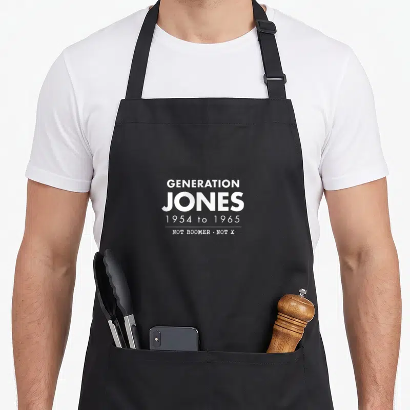
Millennial x apron - White stacked text reading Generation Jones 1954 to 1965 Not Boomer Not X
US$19.95
Flat US$4.95 US shipping · free over US$65.00 · sales tax is calculated from your shipping address at checkout.
1
US$19.95
Delivery to United States
Arrives —
Orders ship within the United States only. Flat US$4.95 shipping under US$65.00 — free from US$65.00.
Returns
Request a return or exchange within 30 days of purchase, for any reason — we cover return shipping.
Printed to order
Every apron is printed after you order it. Please allow 1-3 business days for processing before it leaves the print shop.
Millennial X Apron Featuring Generation Jones Typography is printed on a black canvas apron — one size, made to order and shipped within the United States.
millennial x apron puts the exact phrase GENERATION JONES across the front panel, and the words 1954 to 1965 NOT BOOMER • NOT X read as a precise demographic boundary rather than a generic label. Wearing it validates the experience of being caught between major cultural eras, and people born within that eleven-year window who reject both older and newer generational tags will feel this was made for them.
Every Detail On The Front
White stacked typography dominates the center of the apron with no illustrations or background graphics. The word GENERATION appears above the larger, bolder word JONES, creating a visual anchor for the design. Below these primary terms, the date range 1954 to 1965 specifies the exact birth years that define this group. A thin horizontal line separates the dates from the final declaration NOT BOOMER • NOT X, which sits at the bottom in smaller type. This four-line arrangement uses only white ink to create high contrast against the fabric. The layout relies entirely on font weight and spacing to convey hierarchy and meaning. Together, these elements form a cohesive statement about identity that belongs strictly to the typographic tradition.
Built For These Hands
Home cooks who identify as Generation Jones notice the specific date range immediately upon seeing the design. This millennial x apron serves as a conversation starter at family gatherings or potlucks where generational stereotypes often arise. The practical 10 oz cotton canvas construction withstands the rigors of daily meal preparation while the two front pockets offer convenient storage for utensils or cleaning cloths. The fabric stiffens initially but yields to comfort after just a few washes, adapting to the wearer's movements. It functions as both protective gear and a subtle signal of shared experience for those who lived through the transition between decades.
Practical Questions
What are the dimensions of the storage pockets on this millennial x apron? Each of the two front pockets measures exactly 8 inches wide by 7 inches tall, providing ample space for holding items securely. The pockets are split in the middle, allowing them to function as separate compartments or merge into a single larger space depending on what you need to carry. This specific measurement ensures that standard kitchen tools and folded towels fit without bulging excessively. The 8 by 7 inch size balances capacity with the overall silhouette of the apron, preventing the pockets from becoming too heavy or awkward when filled.
How does the ink hold up against repeated washing cycles? The white printed text remains intact and legible through multiple washes because the printing process bonds deeply with the 10 oz cotton canvas fibers. Since the design consists solely of solid white lettering without complex gradients or fine details, there are no fragile edges prone to cracking or peeling. You can wash the apron normally without fear of the message fading or the typography losing its crisp appearance. The durability comes from the simplicity of the monochromatic design working in harmony with the sturdy fabric base.
Why does this design specifically reference the years 1954 to 1965? This particular date range defines the Generation Jones cohort as those born after the traditional Baby Boomer cutoff but before the start of Generation X. The inclusion of these specific numbers distinguishes this apron from generic generational wear that might use broader ranges like 1955-1975. The text NOT BOOMER • NOT X reinforces that this is not about joining a larger group but about claiming a distinct middle identity. Only an apron with this exact typographic specification addresses the nuanced experience of being born in this precise eleven-year span.
Every apron is printed after you order it. Orders are processed Monday through Friday, excluding federal holidays — please allow 1-3 business days for order processing. After processing, shipping typically takes 3-7 business days inside the United States, so the total delivery time from order placement is 4-10 business days.
US orders under US$65.00 pay a flat US$4.95 shipping; orders of US$65.00 or more ship free. Bearhap ships within the United States only — we do not ship to international addresses.
You may request a return or exchange within 30 days of the purchase date, for any reason. The apron must be unopened, unused and in its original packaging, with proof of purchase. We refund the item price in full to the original payment method — the original US$4.95 shipping fee is not refundable — and Bearhap covers all return shipping costs: email contact@bearhap.com for a free return label.
Care
Machine wash cold, inside out, with like colours. Tumble dry low or hang to dry. Do not iron directly over the print — press from the back if you need to. No bleach, no dry cleaning.
The ink is water-based and cures into the fabric, so it will soften with the canvas rather than peel off it.
Questions about Z aprons
- Who is the best fit for these themed bib aprons?
- These aprons suit anyone who enjoys visual humor, retro styles, or specific hobby references. They are ideal for chefs, artists, and home cooks who want to display their personality through unique printed designs rather than plain colors.
- What types of themes are included in this set?
- The set features themes ranging from seventy fashion trends and internet memes to animal motifs and educational concepts. Each design tells a story through imagery related to dinosaurs, cats, ocean exploration, or financial lifestyle.
- How do I choose the right print for my style?
- Select a design based on your personal interests or inside jokes. Consider if you prefer nostalgic seventies vibes, modern meme culture, or playful animal illustrations to match your daily routine and professional environment.
You might also like
More z
- millennial meme apron
- boomer meme apron
- funny generation gen apron
- boomer trending aprons
- stay x apron
- xer x apron
- care x apron
- generation 40th birthday apron