
Writing
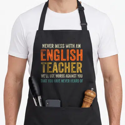
Nazy English Apron Featuring Red Teal and Yellow Typography
Nazy english apron - Stacked text reading there are people who didn't listen to their teacher's grammar lessons
US$19.95
Flat US$4.95 US shipping · free over US$65.00 · sales tax is calculated from your shipping address at checkout.
1
US$19.95
Delivery to United States
Arrives —
Orders ship within the United States only. Flat US$4.95 shipping under US$65.00 — free from US$65.00.
Returns
Request a return or exchange within 30 days of purchase, for any reason — we cover return shipping.
Printed to order
Every apron is printed after you order it. Please allow 1-3 business days for processing before it leaves the print shop.
Nazy English Apron Featuring Red Teal and Yellow Typography is printed on a black canvas apron — one size, made to order and shipped within the United States.
nazy english apron puts the phrase THERE ARE PEOPLE WHO DIDN'T LISTEN TO THEIR TEACHER'S GRAMMAR LESSONS AND THEY'RE DRIVING ME NUTS across the front panel, and the words land as a sarcastic expression of frustration toward common language errors. Wearing it acts as a visible boundary against bad grammar, and this design was created specifically for educators and linguists who are irritated by the misuse of homophones.
The Graphic, Piece By Piece
The central subject is a multi-colored typographic stack that dominates the front panel using only red, teal, yellow, and white ink. Small white stars are arranged in rows flanking the third and sixth lines of text, breaking up the solid blocks of lettering. The word THERE appears in large red letters at the top, followed by smaller white explanatory text. The word THEIR is rendered in teal below the middle section, while THEY'RE stands out in yellow near the bottom. This layout belongs to the genre of typography-only art that prioritizes legibility over illustration. The combination of bright colors and strict alignment reinforces the serious tone of the sarcastic message.
Days You Would Grab It
English teachers and language majors notice the specific color-coding of the three confusing pronouns immediately. This nazy english apron makes an ideal gift for someone who spends their free time correcting punctuation in manuscripts. It is worn in daily situations like grading essays or hosting study groups where proper usage is expected. The design appeals to anyone who feels personally annoyed by widespread grammatical negligence.
Before Buying
What are the measurements of the nazy english apron to ensure it fits my body size? The nazy english apron has a body size of 28 inches wide by 34 inches long to provide adequate coverage. These dimensions ensure the full graphic remains visible without being cut off at the hem or sides during movement.
How does the ink on this typography-only design hold up against frequent washing and kitchen use? The ink durability relies on the quality of the print application rather than fabric type. Since the design consists solely of text and simple shapes, there are no gradients or fine details prone to cracking. Standard care instructions will maintain the sharpness of the red, teal, and yellow lettering through repeated cleaning cycles.
Does the star layout in this design imply a specific number of grammar mistakes tolerated? No, the stars are purely decorative elements placed next to specific lines of text for visual balance. They do not represent a count of errors or a quota of acceptable mistakes. The design focuses on the textual complaint rather than quantitative metrics of correctness.
Every apron is printed after you order it. Orders are processed Monday through Friday, excluding federal holidays — please allow 1-3 business days for order processing. After processing, shipping typically takes 3-7 business days inside the United States, so the total delivery time from order placement is 4-10 business days.
US orders under US$65.00 pay a flat US$4.95 shipping; orders of US$65.00 or more ship free. Bearhap ships within the United States only — we do not ship to international addresses.
You may request a return or exchange within 30 days of the purchase date, for any reason. The apron must be unopened, unused and in its original packaging, with proof of purchase. We refund the item price in full to the original payment method — the original US$4.95 shipping fee is not refundable — and Bearhap covers all return shipping costs: email contact@bearhap.com for a free return label.
Care
Machine wash cold, inside out, with like colours. Tumble dry low or hang to dry. Do not iron directly over the print — press from the back if you need to. No bleach, no dry cleaning.
The ink is water-based and cures into the fabric, so it will soften with the canvas rather than peel off it.
Questions about Writing aprons
- Who should buy this specific set?
- This set is ideal for published authors, aspiring novelists, and poetry enthusiasts who spend significant time at their desks. It appeals to anyone who identifies deeply with the literary profession and wants to wear their passion visibly while working on manuscripts or editing drafts.
- What themes are represented?
- Themes include traditional publishing symbols like typewriters, poetic verse layouts, and scenic travel imagery. Designs also feature references to screenwriting and ancient Hebrew scripts, offering variety for writers interested in diverse narrative forms and historical linguistic connections within their creative process.
- How do I choose a design?
- Select based on your preferred genre. Choose typewriter motifs for fiction writers, verse patterns for poets, or landscape scenes for travel-inspired creators. Screenwriter-focused designs suit those working in visual storytelling. Consider which symbol best represents your current project or personal identity as a creator.
You might also like
More writing
- toz sarcastic apron
- writing writer apron
- writing apron or apron
- yall teacher apron
- english grammar teacher apron
- grammar english apron
- their english apron
- sometime quirky apron