Forty
Outta Forty Birthday Apron Featuring Straight Outta My
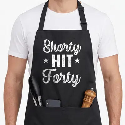
Outta forty birthday apron - Stacked white and grey text reading straight outta my forties inside a rectangular border
US$19.95
Flat US$4.95 US shipping · free over US$65.00 · sales tax is calculated from your shipping address at checkout.
1
US$19.95
Delivery to United States
Arrives —
Orders ship within the United States only. Flat US$4.95 shipping under US$65.00 — free from US$65.00.
Returns
Request a return or exchange within 30 days of purchase, for any reason — we cover return shipping.
Printed to order
Every apron is printed after you order it. Please allow 1-3 business days for processing before it leaves the print shop.
Outta Forty Birthday Apron Featuring Straight Outta My is printed on a black canvas apron — one size, made to order and shipped within the United States.
The outta forty birthday apron puts the phrase STRAIGHT OUTTA MY FORTIES across the front panel, and the stacked white and grey lettering lands as a grunge-style pun about reaching age forty. Wearing it signals that the wearer is celebrating a major milestone with humor, and friends attending a 40th birthday party will recognize the reference immediately. The design relies entirely on typography without illustrations, using a textured white and grey palette contained within a white rectangular border. The three-line layout creates a blocky visual impact that mimics vintage street signage or album covers. This typographic approach ensures the message remains the focal point, making it a clear statement piece for someone marking their fortieth year. The distressed texture of the ink adds a retro feel that aligns with the milestone theme without needing extra graphics.
The Design Itself
This outta forty birthday apron centers on a typography-only art style featuring bold, distressed lettering in white and grey. The text is arranged in three stacked lines enclosed by a thin white rectangular border that frames the composition. The top line reads STRAIGHT in white block letters against a grey background, while the middle line displays OUTTA in large grey characters against white. The bottom line returns to white text reading MY FORTIES, completing the stack. The grunge aesthetic gives the print a weathered look similar to vintage street signs or punk rock posters. This specific color combination of white and grey keeps the design high-contrast and legible from a distance. The layout avoids any figurative imagery, relying instead on the weight of the font and the texture of the ink to convey attitude. Together, these elements form a cohesive graphic that celebrates the fortieth birthday through stylized text rather than traditional party motifs.
Occasions It Fits
This design targets the 40th birthday celebration, specifically appealing to men or women who want a funny gift for the milestone. The outta forty birthday apron works best when the recipient is the one cooking or serving at their own party. It fits the situation of a casual birthday gathering where the host wants to blend utility with a cheeky acknowledgment of their age. Family members and friends often choose this item because it pairs well with other grunge-themed decor or apparel. The apron transforms a standard kitchen task into part of the birthday festivities, making the wearer the center of attention through wordplay. It is particularly suited for those who appreciate the specific cultural reference embedded in the text rather than generic age-related slogans.
Things People Ask
What are the waist tie measurements for this apron? The waist ties measure 42 inches on each side, providing enough length to tie securely in the front. This substantial measurement accommodates various body sizes and allows for multiple knotting options behind the back or in front. The extra length ensures the apron stays fastened comfortably even over bulky clothing layers often worn at parties. Users can adjust the fit easily without the straps being too short to reach around the waist.
How durable is the grey and white ink during washing? The printed ink holds up well because it is applied directly to the fabric surface in a solid block. The white and grey colors remain distinct after laundering due to the high opacity of the print method used. Distressed textures in the design help mask minor fading that occurs naturally over time, maintaining the intended vintage aesthetic. Standard washing routines preserve the integrity of the lettering without requiring special cold water treatments or hand washing.
Does the text refer to the 1980s or turning forty? The text refers to turning forty years old, not the decade of the 1980s. The phrase uses a well-known colloquialism structure to mark the specific milestone age of the wearer. While the grunge font style evokes retro aesthetics, the words MY FORTIES explicitly denote the number of years lived. This distinction clarifies that the product is a birthday gift for someone hitting the 40-year mark rather than a nostalgic reference to a past era.
Every apron is printed after you order it. Orders are processed Monday through Friday, excluding federal holidays — please allow 1-3 business days for order processing. After processing, shipping typically takes 3-7 business days inside the United States, so the total delivery time from order placement is 4-10 business days.
US orders under US$65.00 pay a flat US$4.95 shipping; orders of US$65.00 or more ship free. Bearhap ships within the United States only — we do not ship to international addresses.
You may request a return or exchange within 30 days of the purchase date, for any reason. The apron must be unopened, unused and in its original packaging, with proof of purchase. We refund the item price in full to the original payment method — the original US$4.95 shipping fee is not refundable — and Bearhap covers all return shipping costs: email contact@bearhap.com for a free return label.
Care
Machine wash cold, inside out, with like colours. Tumble dry low or hang to dry. Do not iron directly over the print — press from the back if you need to. No bleach, no dry cleaning.
The ink is water-based and cures into the fabric, so it will soften with the canvas rather than peel off it.
Questions about Forty aprons
- Who is the ideal buyer for these aprons?
- These aprons are made for anyone celebrating their fortieth birthday or wanting funny gift for a friend entering this milestone. They suit people who enjoy lighthearted humor about aging and want to wear their age proudly during celebrations.
- What types of designs are included?
- The collection features various styles including witty phrases, milestone markers like chapter titles, and specific age references such as forty-three. Designs range from simple text-based jokes to more elaborate graphics that celebrate the transition into middle age with charm.
- How do I choose the right one?
- Select based on the recipient's sense of humor and specific age if known. Consider whether they prefer subtle nods to their youth or bold statements about their current life stage. Matching the design tone to their personality ensures the gift feels personal and appreciated.
You might also like
More forty
- cute forty 40th birthday apron
- forty 41st birthday apron
- shorty 40th birthday apron
- vintage forty 40th birthday apron
- outta 40th birthday apron
- straight 40th birthday apron
- outta 38th birthday apron
- outta 20th birthday apron