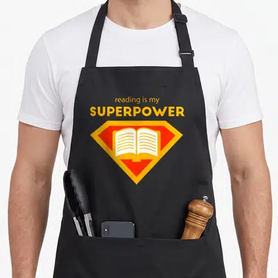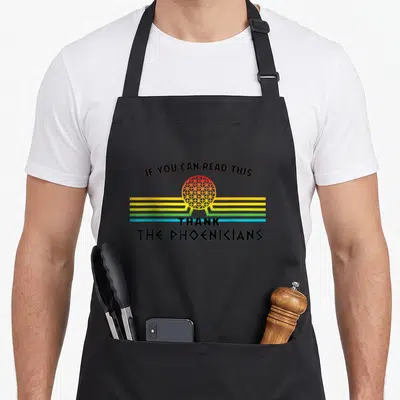

Reading
Reading Easy Apron Featuring Sarcastic Typography About
Reading easy apron - White text reading Reading Japanese is really easy next to rotated symbols
US$19.95
Flat US$4.95 US shipping · free over US$65.00 · sales tax is calculated from your shipping address at checkout.
1
US$19.95
Delivery to United States
Arrives —
Orders ship within the United States only. Flat US$4.95 shipping under US$65.00 — free from US$65.00.
Returns
Request a return or exchange within 30 days of purchase, for any reason — we cover return shipping.
Printed to order
Every apron is printed after you order it. Please allow 1-3 business days for processing before it leaves the print shop.
Reading Easy Apron Featuring Sarcastic Typography About is printed on a black canvas apron — one size, made to order and shipped within the United States.
The reading easy apron puts the phrase reading Japanese is really easy across the front panel, paired with vertical Japanese characters rotated ninety degrees counter-clockwise. The text reads as a sarcastic command that lands as a visual pun requiring the viewer to physically tilt their head to understand the message. Wearing it signals a dry sense of humor to fellow language students, and this specific design was made for anyone who has stared at complex scripts feeling completely lost.
What The Print Says
The artwork utilizes a strict two-column layout composed entirely of white typography on a dark surface. The right column stacks the English sentence horizontally, while the left column presents the Japanese characters rotated vertically so they appear sideways to an upright observer. This specific arrangement forces the reader to turn their head to align the symbols with the English text, fulfilling the promise of the written words. The design belongs to the category of linguistic humor where the medium of display reinforces the satirical message about language acquisition.
The Cook It Was Made For
Language students and polyglots notice the clever manipulation of character orientation first. Gifting this reading easy apron works well for Christmas, New Year, or graduation celebrations for anyone studying East Asian languages. It gets worn in everyday kitchen situations where the wearer wants to express frustration with their studies through irony rather than explicit complaint.
Ordering Questions
Does the adjustable neck strap accommodate different heights? Yes, the neck strap measures between twenty and thirty inches to ensure a proper fit for various body types. This range allows the apron to sit correctly on the chest without being too tight or hanging loosely around the neck area for both shorter and taller individuals. Can the white ink withstand repeated washing cycles? The white print is durable enough to handle standard laundering without significant fading or peeling. You can wash the apron normally to maintain the contrast between the bright lettering and the black fabric throughout its lifespan. Why does the design require a specific viewing angle? The Japanese characters are intentionally rotated ninety degrees counter-clockwise to mimic the experience of seeing unfamiliar script. This visual trick enacts the joke that understanding the language requires a physical shift in perspective, making the design interactive rather than static.
Every apron is printed after you order it. Orders are processed Monday through Friday, excluding federal holidays — please allow 1-3 business days for order processing. After processing, shipping typically takes 3-7 business days inside the United States, so the total delivery time from order placement is 4-10 business days.
US orders under US$65.00 pay a flat US$4.95 shipping; orders of US$65.00 or more ship free. Bearhap ships within the United States only — we do not ship to international addresses.
You may request a return or exchange within 30 days of the purchase date, for any reason. The apron must be unopened, unused and in its original packaging, with proof of purchase. We refund the item price in full to the original payment method — the original US$4.95 shipping fee is not refundable — and Bearhap covers all return shipping costs: email contact@bearhap.com for a free return label.
Care
Machine wash cold, inside out, with like colours. Tumble dry low or hang to dry. Do not iron directly over the print — press from the back if you need to. No bleach, no dry cleaning.
The ink is water-based and cures into the fabric, so it will soften with the canvas rather than peel off it.
Questions about Reading aprons
- Who is the ideal wearer for these literary-themed bibs?
- These aprons suit avid readers, librarians, and book club members who wish to display their passion for literature during casual outings or creative writing sessions. They appeal to anyone who identifies strongly with the culture of reading and wants a subtle yet clear signal of their hobby to others around them.
- What variety of designs does this niche offer?
- The range includes themes like book dinosaurs for fantasy fans, rainbow motifs for inclusivity, and nocturnal settings for night owls. Each design captures a different facet of the reading experience, from the anxiety of empty shelves to the joy of discovering new worlds through printed pages and digital formats alike.
- How do I choose the right design among many options?
- Consider your personal reading habits and favorite genres. If you enjoy cozy vibes, pick the cat or night reading styles. For broader appeal, the book lover or standard read book options work well. Those concerned about library fines might relate to the abibliophobia theme, ensuring the design resonates with your unique literary personality.
You might also like
More reading
- read reading apron
- read sarcastic apron
- reading funny book apron
- reading quiz apron
- writing korean apron
- japanese studying apron
- written japan apron
- author simple apron