Rochester
Rochester 70s Apron Featuring Distressed ROCHESTER Text
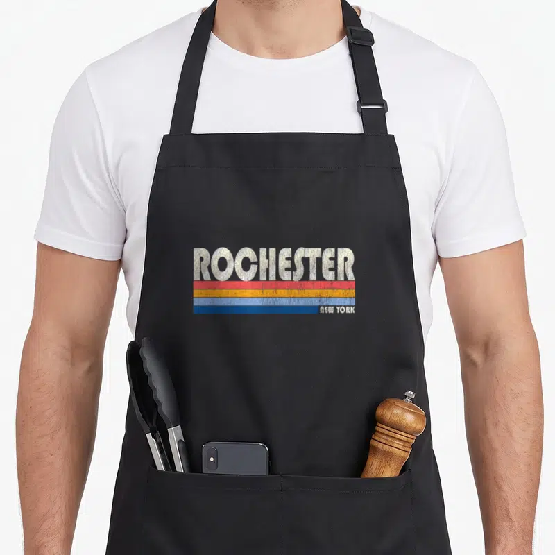
Rochester 70s apron - Distressed ROCHESTER text above red orange and blue stripes with small NEW YORK label
US$19.95
Flat US$4.95 US shipping · free over US$65.00 · sales tax is calculated from your shipping address at checkout.
1
US$19.95
Delivery to United States
Arrives —
Orders ship within the United States only. Flat US$4.95 shipping under US$65.00 — free from US$65.00.
Returns
Request a return or exchange within 30 days of purchase, for any reason — we cover return shipping.
Printed to order
Every apron is printed after you order it. Please allow 1-3 business days for processing before it leaves the print shop.
Rochester 70s Apron Featuring Distressed ROCHESTER Text is printed on a black canvas apron — one size, made to order and shipped within the United States.
rochester 70s apron displays the text ROCHESTER in large white letters above three horizontal stripes in red, orange, and blue. The phrase NEW YORK appears in small print on the right side of the bottom stripe. This design serves as a retro city pride statement rather than a joke. Wearing it signals hometown loyalty to those who know the area. Residents and visitors from Rochester New York feel this specific graphic was made for them.
The Design Itself
The central focus of this panel is the word ROCHESTER rendered in a bold, sans-serif typeface with a heavily distressed finish. Directly beneath the main text, three parallel bars run horizontally across the width, colored sequentially in red, orange, and blue. On the right edge of the lowest blue bar, the words NEW YORK appear in a much smaller, matching white font. The entire composition uses a limited palette of white, red, orange, and blue to create a cohesive vintage aesthetic. The distressed texture mimics the wear of an old screen print, adding depth to the flat colors. This arrangement transforms simple geography into a stylized graphic reminiscent of 1970s travel posters. The lack of imagery ensures the focus remains solely on the textual declaration of place.
Occasions It Fits
Home cooks and DIY enthusiasts appreciate this straightforward tribute to their local area. It works well as a gift for someone moving away from or returning to Rochester New York. The design fits easily into everyday kitchen tasks or workshop projects where a personal touch is desired without being distracting. This rochester 70s apron acts as a subtle uniform for anyone taking pride in their regional roots. Its neutral tone and structured layout make it appropriate for both casual home use and informal public appearances related to local culture.
Things People Ask
What are the pocket dimensions on this apron? The two front pockets measure 8 by 7 inches each and are split in the middle. This specific sizing provides ample space for holding tools or phones while keeping the fabric structure stable. The split design allows the pockets to expand slightly when filled without pulling excessively on the waist ties. Users find this dimension sufficient for carrying standard kitchen utensils or small craft supplies comfortably throughout a long session.
How does the ink hold up during washing? The distressed effect is part of the intentional design and will not fade or peel like damaged printing. Because the texture mimics age, minor surface wear blends seamlessly with the original aesthetic rather than looking like damage. The ink adheres to the 10 oz cotton canvas fabric in a way that withstands standard laundering cycles without cracking. You can wash this garment regularly without worrying about losing the graphic integrity or the vintage character.
Does the design reference a specific brand or product? No, the text refers strictly to the geographic location of Rochester, New York, and does not imply any commercial sponsorship. The visual style imitates general retro aesthetics common in mid-century Americana rather than a specific corporate logo. There are no trademarks or proprietary symbols included in the artwork, making it a generic expression of city pride. Anyone recognizing the name understands it as a reference to the place itself, not a merchandise line.
Every apron is printed after you order it. Orders are processed Monday through Friday, excluding federal holidays — please allow 1-3 business days for order processing. After processing, shipping typically takes 3-7 business days inside the United States, so the total delivery time from order placement is 4-10 business days.
US orders under US$65.00 pay a flat US$4.95 shipping; orders of US$65.00 or more ship free. Bearhap ships within the United States only — we do not ship to international addresses.
You may request a return or exchange within 30 days of the purchase date, for any reason. The apron must be unopened, unused and in its original packaging, with proof of purchase. We refund the item price in full to the original payment method — the original US$4.95 shipping fee is not refundable — and Bearhap covers all return shipping costs: email contact@bearhap.com for a free return label.
Care
Machine wash cold, inside out, with like colours. Tumble dry low or hang to dry. Do not iron directly over the print — press from the back if you need to. No bleach, no dry cleaning.
The ink is water-based and cures into the fabric, so it will soften with the canvas rather than peel off it.
Questions about Rochester aprons
- Who is this collection best suited for?
- These aprons suit Rochester locals, alumni, and visitors who want to display hometown pride. They are ideal for professionals working in tech or education sectors within the area. Residents attending local festivals or visiting family will find these designs meaningful and appropriate for casual wear.
- What specific designs are included here?
- You will find styles honoring Jeff Rochester, RIT, and local technology hubs. The collection includes nods to New York state pride and specific city landmarks. Each piece focuses on unique cultural references rather than generic patterns, ensuring a distinct local connection.
- How do I choose the right design?
- Select based on your personal connection to the featured institution or sport. If you attend RIT, the institute design fits best. Sports fans might prefer the Jeff Rochester style. Consider your daily activities and which local reference resonates most with your personal history and interests.
You might also like
More rochester
- rochester souvenir new york apron
- rochester 70s new york apron
- rochester area new york apron
- rochester state new york apron
- rochester skyline new york apron
- cityscape rochester apron
- someone rochester apron
- paltz 70s apron