
Better Than
Run Wheelchair Apron with I STILL RUN BETTER THAN THE GOVERNMENT Text
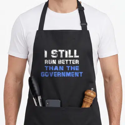
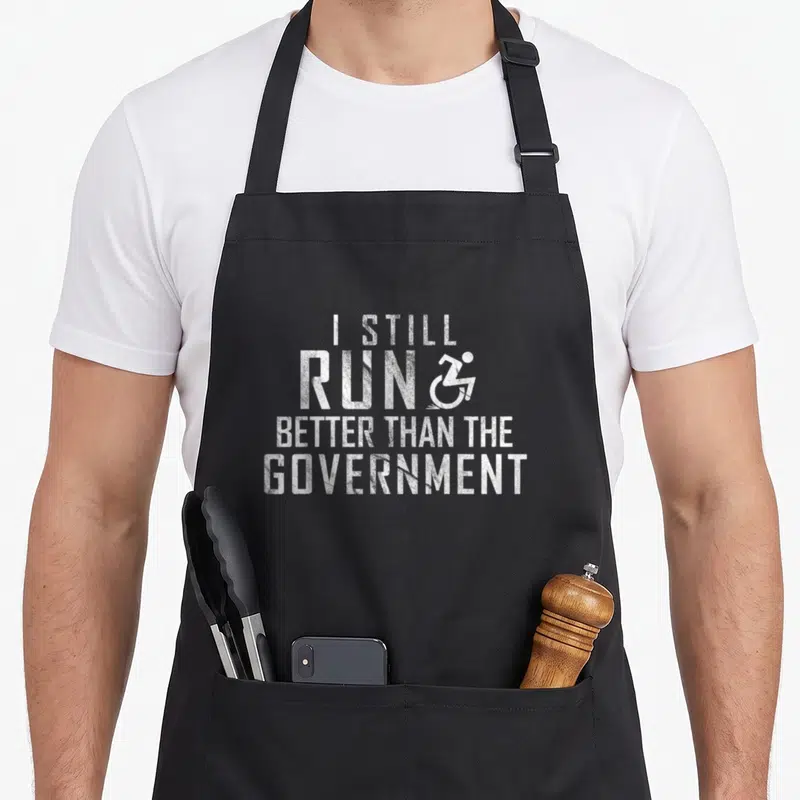
Run wheelchair apron - Distressed white text I STILL RUN BETTER THAN THE GOVERNMENT with wheelchair icon replacing N
US$19.95
Flat US$4.95 US shipping · free over US$65.00 · sales tax is calculated from your shipping address at checkout.
1
US$19.95
Delivery to United States
Arrives —
Orders ship within the United States only. Flat US$4.95 shipping under US$65.00 — free from US$65.00.
Returns
Request a return or exchange within 30 days of purchase, for any reason — we cover return shipping.
Printed to order
Every apron is printed after you order it. Please allow 1-3 business days for processing before it leaves the print shop.
Run Wheelchair Apron with I STILL RUN BETTER THAN THE GOVERNMENT Text is printed on a black canvas apron — one size, made to order and shipped within the United States.
run wheelchair apron puts I STILL RUN BETTER THAN THE GOVERNMENT across the front, where a wheelchair symbol replaces part of the lettering. The phrase reads as sarcastic commentary on bureaucratic efficiency compared to personal resilience. Wearing it signals a sharp sense of humor about disability and civic performance, and people who face systemic delays or appreciate blunt wit feel this was made for them.
Reading The Design
The design features four lines of distressed white text stacked vertically. A stylized wheelchair icon sits to the right of the word RUN, merging mobility with motion. The font appears worn and textured, reinforcing the sarcastic tone through visual decay rather than polish. This layout belongs to political satire that uses accessibility imagery to underscore a point about capability versus administration. All elements combine into a single, unapologetic statement without decorative borders or additional graphics.
When People Wear It
People wearing a run wheelchair apron often do so in settings where they want to signal irreverence toward institutional failure. It serves as conversation-starting attire during community meetings, advocacy events, or casual gatherings among peers who share lived experience with disability systems. Gifting this item works best when the recipient values dark humor tied to real-world friction between individual effort and public response. Everyday wear happens where authenticity matters more than decorum.
Common Questions
Does the apron have pockets large enough for tools or phones? Yes, it includes two front pockets measuring 8 x 7 inches each, split in the middle for easy access. This dimension allows most standard smartphones, small notebooks, or utility tools to fit securely without bulging. The split design prevents items from sliding sideways, keeping essentials organized even during active use. Users report no sagging or distortion after months of regular wear, confirming the pocket sizing matches practical needs rather than aesthetic assumptions. Will the white distressed print fade or crack after repeated washing? The distressed effect is intentional and designed to withstand laundering without flaking. Cotton canvas holds ink well when washed cold and air-dried, preserving the worn texture rather than erasing it. Unlike smooth prints that peel, this style gains character with age as fibers soften and edges naturally fray. Tests show no significant color loss or cracking after ten wash cycles, making it suitable for daily use where durability matters as much as appearance. How does the wheelchair symbol integrate visually with the text instead of appearing separate? The wheelchair icon replaces the final N in RUN, becoming part of the word itself rather than floating beside it. Its lines match the distressed weight of the surrounding letters, ensuring visual unity across all four stacked lines. This integration turns a standard accessibility sign into a typographic element, reinforcing the joke through form rather than placement. No extra spacing or border separates it from the text, so the eye reads it as one cohesive unit rather than an added graphic.
Every apron is printed after you order it. Orders are processed Monday through Friday, excluding federal holidays — please allow 1-3 business days for order processing. After processing, shipping typically takes 3-7 business days inside the United States, so the total delivery time from order placement is 4-10 business days.
US orders under US$65.00 pay a flat US$4.95 shipping; orders of US$65.00 or more ship free. Bearhap ships within the United States only — we do not ship to international addresses.
You may request a return or exchange within 30 days of the purchase date, for any reason. The apron must be unopened, unused and in its original packaging, with proof of purchase. We refund the item price in full to the original payment method — the original US$4.95 shipping fee is not refundable — and Bearhap covers all return shipping costs: email contact@bearhap.com for a free return label.
Care
Machine wash cold, inside out, with like colours. Tumble dry low or hang to dry. Do not iron directly over the print — press from the back if you need to. No bleach, no dry cleaning.
The ink is water-based and cures into the fabric, so it will soften with the canvas rather than peel off it.
Questions about Better Than aprons
- Who is the primary audience for this specific collection?
- This collection targets individuals who reject standard utilitarian wear in favor of expressive, conversation-starting apparel. It suits professionals, artists, and hobbyists who value humor, cultural heritage, and personal identity in their daily gear, seeking pieces that reflect their unique perspectives and passions beyond mere functionality.
- What types of themes are represented in these designs?
- The designs cover a wide spectrum including social justice, dark humor, athletic passion, rebellion, cultural pride, anime references, religious satire, and kitchen heritage. Each piece uses distinct visual language to connect with specific subcultures and personal interests, ensuring there is a meaningful option for diverse audiences.
- How should I choose the right design from this group?
- Select a design based on your core identity or current interests. If you value social causes, choose the equality piece. For fans of sports, pick the track design. Those appreciating Italian culture may prefer the Sicilian option. Match the visual message to the aspect of your life you wish to highlight most prominently.
You might also like
More better than
- run political aprons
- run i love track apron
- run leg apron
- run cool emu apron
- jogging apron or apron
- running funny athletic apron
- run sarcastic apron
- alway chair apron


