Stranger
Season Stranger Apron WSQK the Squawk 94.5 FM Retro Logo
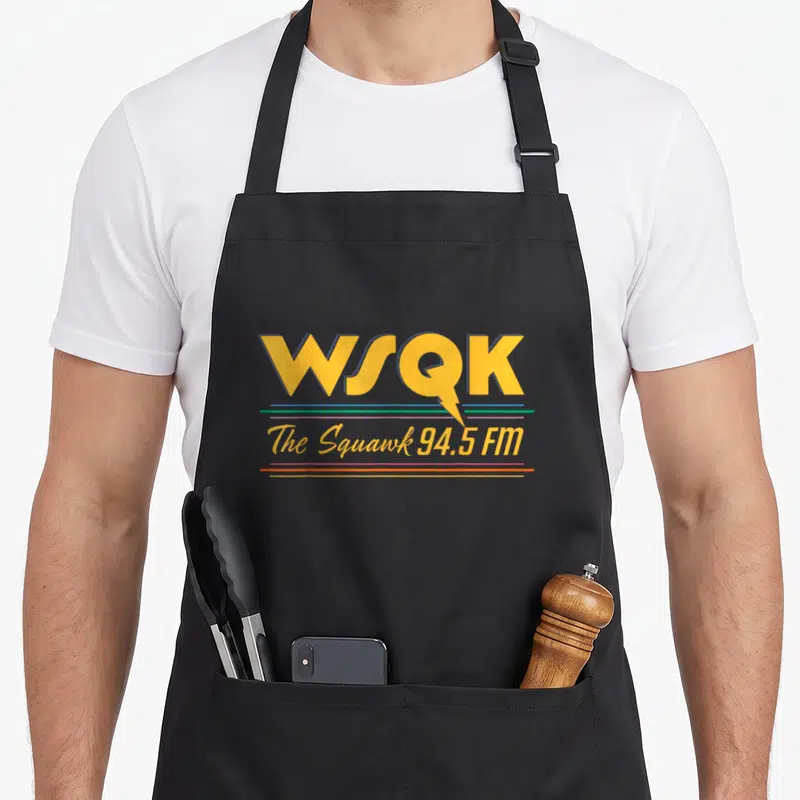
Season stranger apron - WSQK logo with lightning bolt and colored horizontal lines reading The Squawk 94.5 FM
US$19.95
Flat US$4.95 US shipping · free over US$65.00 · sales tax is calculated from your shipping address at checkout.
1
US$19.95
Delivery to United States
Arrives —
Orders ship within the United States only. Flat US$4.95 shipping under US$65.00 — free from US$65.00.
Returns
Request a return or exchange within 30 days of purchase, for any reason — we cover return shipping.
Printed to order
Every apron is printed after you order it. Please allow 1-3 business days for processing before it leaves the print shop.
Season Stranger Apron WSQK the Squawk 94.5 FM Retro Logo is printed on a black canvas apron — one size, made to order and shipped within the United States.
The season stranger apron puts the printed words WSQK and The Squawk 94.5 FM across the front panel, and the large yellow letters read as a stylized radio station identifier. A lightning bolt extending from the Q lands as a dynamic visual accent that connects the acronym to the slogan below. Wearing it displays adherence to retro broadcast design principles, and collectors of fictional media merchandise feel this piece was made for them.
Looking At The Front Panel
The artwork centers the bold acronym WSQK in yellow with a dark border on the upper panel. Three horizontal lines in blue, green, and purple sit directly beneath the main text before the slogan appears. The phrase The Squawk 94.5 FM is rendered in a flowing yellow script that matches the primary color of the logo. A sharp lightning bolt shape extends from the bottom of the letter Q, piercing through the colored lines. This typography-only composition relies entirely on the arrangement of these specific colors and shapes to convey its identity. The design belongs to the realm of 1980s-inspired supernatural fiction and serves as a direct reference to a specific fictional frequency rather than a generic pattern.
Who Gets The Joke
Viewers familiar with 1980s supernatural dramas notice the specific color palette and layout first. This season stranger apron functions as a gifting option for fans who collect items related to fictional broadcast stations. It gets worn in casual social settings where shared knowledge of the show's setting creates immediate recognition. The design appeals to those who enjoy the mystery and atmosphere of the series without relying on character imagery or explicit humor. The black bib provides a neutral background that makes the yellow and multicolored lines pop visually in any lighting condition.
Answers Up Front
What is the neck strap measurement range on this black bib apron? The adjustable neck strap measures between 20 and 30 inches to accommodate various body types. This specific range ensures the generous cut fits most adults comfortably without being too loose or restrictive. The hardware allows for precise positioning so the center of the WSQK logo remains aligned with the wearer's chest. Proper adjustment prevents the apron from slipping or shifting during movement, keeping the typography fully visible at all times.
How does the ink durability perform during washing cycles for this design? The printed ink remains intact after repeated washes because it adheres firmly to the black fabric surface. The high contrast between the yellow lettering and the dark background helps maintain visual clarity even after multiple cleaning cycles. No special detergents or temperature controls are required to preserve the integrity of the three colored horizontal lines. The typography-only style avoids delicate gradients that might fade, ensuring the bold outlines stay crisp over time.
What specific visual element distinguishes this station logo from standard radio branding? A lightning bolt extending from the letter Q sets this design apart from typical broadcast logos. This graphic detail transforms the standard Q into a speech bubble shape while adding a supernatural connotation to the frequency. Standard radio station identifiers rarely incorporate electrical imagery directly into their typography. The inclusion of this bolt links the visual identity to the genre's themes of strange occurrences and otherworldly energy.
Every apron is printed after you order it. Orders are processed Monday through Friday, excluding federal holidays — please allow 1-3 business days for order processing. After processing, shipping typically takes 3-7 business days inside the United States, so the total delivery time from order placement is 4-10 business days.
US orders under US$65.00 pay a flat US$4.95 shipping; orders of US$65.00 or more ship free. Bearhap ships within the United States only — we do not ship to international addresses.
You may request a return or exchange within 30 days of the purchase date, for any reason. The apron must be unopened, unused and in its original packaging, with proof of purchase. We refund the item price in full to the original payment method — the original US$4.95 shipping fee is not refundable — and Bearhap covers all return shipping costs: email contact@bearhap.com for a free return label.
Care
Machine wash cold, inside out, with like colours. Tumble dry low or hang to dry. Do not iron directly over the print — press from the back if you need to. No bleach, no dry cleaning.
The ink is water-based and cures into the fabric, so it will soften with the canvas rather than peel off it.
Questions about Stranger aprons
- Who is the ideal buyer for this themed apron set?
- This collection suits dedicated fans of the popular eighties sci-fi series who enjoy cooking or crafting while wearing apparel that references their favorite characters and monsters. It is made for those who want to display their loyalty to the fictional town of Hawkins during daily activities.
- What specific elements are included in this design range?
- The range includes prints featuring the Demogorgon monster, the Hellfire Club logo, and portraits of key characters like Steve and Eddie. Each design captures distinct moments or symbols from the show, ranging from subtle nods to bold illustrations that celebrate the supernatural thriller genre.
- How should I choose the right design from this set?
- Select a design based on your favorite character or most memorable scene from the series. If you prefer iconic villains, choose the monster print. For emotional connections, pick the character-focused designs. Consider whether you want bold imagery or simpler references when selecting your preferred style.
You might also like
More stranger
- wsqk stranger apron
- funny simple apron
- season 80s apron
- season distressed apron
- s5v1 novelty apron
- funny gradient novelty apron
- season novelty apron
- season video game apron