Dyslexia
Sexdaily Dyslexia Apron Featuring White Stacked Typography
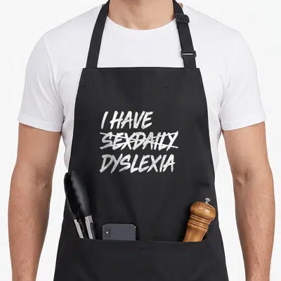
Sexdaily dyslexia apron - White text I HAVE SEXDAILY DYSLEXIA with strikethrough on middle word
US$19.95
Flat US$4.95 US shipping · free over US$65.00 · sales tax is calculated from your shipping address at checkout.
1
US$19.95
Delivery to United States
Arrives —
Orders ship within the United States only. Flat US$4.95 shipping under US$65.00 — free from US$65.00.
Returns
Request a return or exchange within 30 days of purchase, for any reason — we cover return shipping.
Printed to order
Every apron is printed after you order it. Please allow 1-3 business days for processing before it leaves the print shop.
Sexdaily Dyslexia Apron Featuring White Stacked Typography is printed on a black canvas apron — one size, made to order and shipped within the United States.
sexdaily dyslexia apron displays the phrase I HAVE, SEXDAILY, DYSLEXIA in three stacked lines of white typography. The middle word features a white strike-through line across it, creating a pun that reads as having dyslexia rather than a daily habit. Wearing it signals humor about literacy challenges to fellow educators and students. This design targets people who appreciate wordplay involving reading difficulties.
Reading The Design
The artwork relies entirely on white typography arranged in a vertical stack across the center of the garment. The top line reads I HAVE in a clean, sans-serif font that matches the bottom line reading DYSLEXIA. The middle line contains the word SEXDAILY, which is visually negated by a horizontal white strike-through line passing directly through its center. This graphical edit mimics the act of proofreading or correcting a mistake, reinforcing the dyslexia concept. The design belongs to the category of typographic humor where the visual layout dictates the final meaning of the sentence. By crossing out the middle term, the print forces the viewer to skip it, resulting in the intended message about the learning difference.
When People Wear It
Educators and literacy specialists often choose this item to signal empathy and humor regarding reading struggles. It functions well as a gift for dyslexia awareness events or for students who identify with the challenge. The sexdaily dyslexia apron fits naturally into kitchen environments where casual banter about language is common. Teachers wearing it in classrooms or workshops use the design to break tension and show they do not take the condition too seriously. The specific reference to a crossed-out word makes this distinct from standard text-based aprons.
Common Questions
What are the measurements of this apron? The body size measures 28 inches wide by 34 inches long to provide adequate torso coverage. Waist ties extend 42 inches on each side to accommodate various sizes. This length ensures the straps can be tied securely in the front without being too short or restrictive. These dimensions create a functional barrier between clothing and spills while displaying the full design clearly. How durable is the white ink during washing? The white ink prints directly onto the fabric surface to maintain sharp edges on the typography. Standard care instructions usually recommend cold water and hanging drying to preserve the strike-through detail. High heat can sometimes degrade the contrast of white text on dark backgrounds over time. Following gentle wash cycles helps keep the crossed-out word distinct from the surrounding letters. Why does the middle word have a line through it? The strike-through is essential to the pun because it changes the reading order of the sentence. Without the line, the phrase would spell out a different, unrelated statement entirely. The visual correction simulates how a reader might skip or misread a word due to dyslexia. This specific graphic element transforms a simple list of words into a cohesive joke about literacy.
Every apron is printed after you order it. Orders are processed Monday through Friday, excluding federal holidays — please allow 1-3 business days for order processing. After processing, shipping typically takes 3-7 business days inside the United States, so the total delivery time from order placement is 4-10 business days.
US orders under US$65.00 pay a flat US$4.95 shipping; orders of US$65.00 or more ship free. Bearhap ships within the United States only — we do not ship to international addresses.
You may request a return or exchange within 30 days of the purchase date, for any reason. The apron must be unopened, unused and in its original packaging, with proof of purchase. We refund the item price in full to the original payment method — the original US$4.95 shipping fee is not refundable — and Bearhap covers all return shipping costs: email contact@bearhap.com for a free return label.
Care
Machine wash cold, inside out, with like colours. Tumble dry low or hang to dry. Do not iron directly over the print — press from the back if you need to. No bleach, no dry cleaning.
The ink is water-based and cures into the fabric, so it will soften with the canvas rather than peel off it.
Questions about Dyslexia aprons
- Who is the primary audience for these aprons?
- These aprons are designed for individuals who identify as dyslexic, including students, teachers, and advocates. They serve as talking point and affirmations for those navigating a world built for non-dyslexic minds, offering a sense of belonging and visibility within the community.
- What types of designs are included in this set?
- The set includes symbolic items like the october ribbon and rainbow leopard prints, alongside informational pieces such as the definition and area code aprons. Each design addresses different aspects of the dyslexic experience, from awareness to celebration of unique cognitive strengths.
- How do I choose the best design for my needs?
- Select a design based on whether you prefer subtle symbolism or direct education. The ribbon and leopard options offer aesthetic appeal, while the definition and area code aprons provide explicit context about dyslexia, making them ideal for teaching or raising awareness in professional settings.
You might also like
More dyslexia
- funny sexdaily dyslexia apron
- sexdaily daily apron
- dyslexia modern apron
- funny dyslexia daily apron
- dyslexic dyslexia awareness apron
- dyslexia daily apron
- dyslexia area code apron
- changing dyslexia apron