Terrible
Sorry 70s Apron Features White Stacked Typography
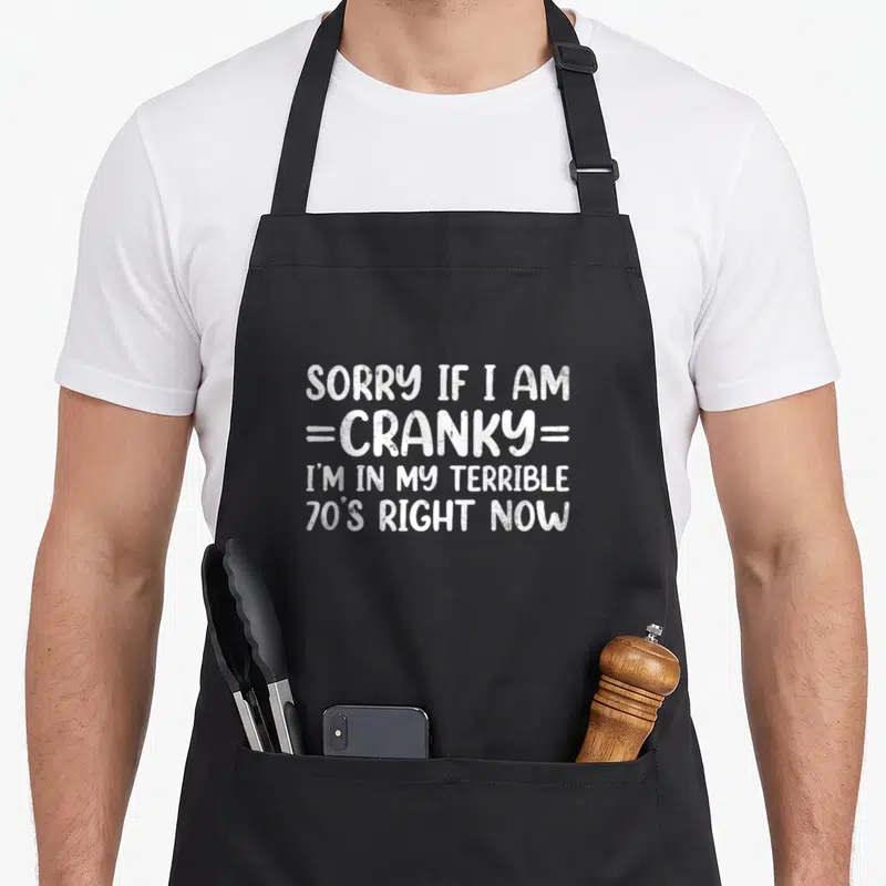
Sorry 70s apron - White stacked text reading Sorry If I Am Cranky I'm In My Terrible 70s Right Now
US$19.95
Flat US$4.95 US shipping · free over US$65.00 · sales tax is calculated from your shipping address at checkout.
1
US$19.95
Delivery to United States
Arrives —
Orders ship within the United States only. Flat US$4.95 shipping under US$65.00 — free from US$65.00.
Returns
Request a return or exchange within 30 days of purchase, for any reason — we cover return shipping.
Printed to order
Every apron is printed after you order it. Please allow 1-3 business days for processing before it leaves the print shop.
Sorry 70s Apron Features White Stacked Typography is printed on a black canvas apron — one size, made to order and shipped within the United States.
sorry 70s apron puts the phrase SORRY IF I AM =CRANKY= I'M IN MY TERRIBLE, 70'S RIGHT NOW across the front panel, and the words read as a sarcastic defense against aging. Wearing it signals that the wearer has zero patience for nonsense, and people who have reached this milestone feel it was made specifically for them.
What You Are Looking At
This design utilizes a typography-only art style where white lettering dominates the central space. The text is arranged in a strict vertical stack consisting of exactly four lines. The first line reads SORRY IF I AM, followed immediately by =CRANKY= which is bracketed by double horizontal bars. The third line states I'M IN MY TERRIBLE, and the final line concludes with 70'S RIGHT NOW. The font mimics a rough, stamped texture that adds to the grumpy tone. The reference to the 70s functions as a cultural idiom for a difficult phase of life rather than a specific birth year. This combination of stark white text and biting humor creates a cohesive statement piece.
The Right Person For It
The person wearing this item belongs to the trade of home cooking but prefers solitude over chatter. They notice the immediate readability of the stacked text when preparing a meal. Gifting this sorry 70s apron works perfectly for a 70th birthday or Christmas because it acknowledges the milestone with humor. It gets worn in real situations where the cook needs to enforce boundaries without speaking. The design validates the feeling of being short-tempered due to age or fatigue.
Details Worth Asking About
What are the exact dimensions of the apron body? The body measures 28 inches wide by 34 inches long to provide ample coverage. This specific width ensures the print sits centrally without stretching toward the edges. The length extends sufficiently down the legs to protect clothing from splatters during active cooking tasks.
How durable is the white ink during washing cycles? The white ink is designed to withstand standard laundering without fading or peeling prematurely. The printing method bonds the pigment deeply into the fabric fibers to resist water and detergent. This durability ensures the sharp edges of the stacked lettering remain crisp after multiple washes.
Does the design reference a specific historical era? The design references the 1970s decade as a metaphorical term for a tough time in life. It does not depict actual images from that period but uses the cultural association of the decade. The phrase implies that reaching this age feels like entering a particularly difficult era, aligning with the sarcastic tone of the text.
Every apron is printed after you order it. Orders are processed Monday through Friday, excluding federal holidays — please allow 1-3 business days for order processing. After processing, shipping typically takes 3-7 business days inside the United States, so the total delivery time from order placement is 4-10 business days.
US orders under US$65.00 pay a flat US$4.95 shipping; orders of US$65.00 or more ship free. Bearhap ships within the United States only — we do not ship to international addresses.
You may request a return or exchange within 30 days of the purchase date, for any reason. The apron must be unopened, unused and in its original packaging, with proof of purchase. We refund the item price in full to the original payment method — the original US$4.95 shipping fee is not refundable — and Bearhap covers all return shipping costs: email contact@bearhap.com for a free return label.
Care
Machine wash cold, inside out, with like colours. Tumble dry low or hang to dry. Do not iron directly over the print — press from the back if you need to. No bleach, no dry cleaning.
The ink is water-based and cures into the fabric, so it will soften with the canvas rather than peel off it.
Questions about Terrible aprons
- Who is this collection best suited for?
- This collection suits gamers, parents, and creative professionals who appreciate self-deprecating humor. It is ideal for anyone who wants to wear their chaotic personality on their sleeve, quite literally. The designs target people who laugh at their own mistakes and enjoy expressing their unique quirks through bold, printed statements on their clothing.
- What makes these designs unique?
- Each design captures a specific niche, from retro gaming nostalgia to the harsh realities of parenting. The le retro gaming apron celebrates vintage video games, while the terrible patient apron offers medical-themed sarcasm. These prints are tailored to resonate with specific hobbies and life stages, making them feel personally crafted rather than generic.
- How should I choose a design?
- Select a design based on your current mood or primary hobby. If you love video games, pick the les retro gaming apron. If you prefer dark humor about health or family, consider the terrible patient apron or alaskas makeup apron. Choose the one that makes you smile when you look down at it during your daily tasks.
You might also like
More terrible
- sorry 60s apron
- through 70s apron
- cranky terrible apron
- cranky cat apron
- sorry terrible apron
- sorry duck apron
- senior 60s apron
- 70s 70th birthday apron