Van
Staying Van Apron Features White Van Graphic
Staying van apron - White van graphic over red 0% sanity text stacked vertically
US$19.95
Flat US$4.95 US shipping · free over US$65.00 · sales tax is calculated from your shipping address at checkout.
1
US$19.95
Delivery to United States
Arrives —
Orders ship within the United States only. Flat US$4.95 shipping under US$65.00 — free from US$65.00.
Returns
Request a return or exchange within 30 days of purchase, for any reason — we cover return shipping.
Printed to order
Every apron is printed after you order it. Please allow 1-3 business days for processing before it leaves the print shop.
Staying Van Apron Features White Van Graphic is printed on a black canvas apron — one size, made to order and shipped within the United States.
The exact phrase staying van apron introduces a design featuring stacked text and a vehicle illustration. The printed words I HAVE 0% SANITY I'M STAYING IN THE VAN appear in white and red ink around a central graphic of a white van. This layout reads as a sarcastic declaration of mental exhaustion regarding mobile living or work. Wearing it signals to others that you understand the specific stress of van life without needing explanation. People who have lived out of a vehicle or worked in tight quarters will feel this was made for them.
The Design Itself
The artwork displays a typography-only composition where bold lettering dominates the front panel. Stacked vertically, the phrase begins with I HAVE in solid white block letters at the top. Below this, 0% SANITY appears in a jagged, red font that suggests instability or distress. A simple white van graphic sits in the middle, overlapping the red word I'M and resting above the large white word STAYING. The bottom line completes the sentence with IN THE VAN in matching white block type. The contrast between the clean white blocks and the scratchy red text reinforces the message of sarcasm. This arrangement places the vehicle directly into the statement, making the van the literal anchor for the sentiment. Every element works together to create a visual representation of being overwhelmed by a specific lifestyle choice.
Occasions It Fits
This staying van apron fits anyone working in mobile environments or enjoying humorous commentary on van life. It serves as a practical gift for birthdays, anniversaries, or retirement for someone who chooses unconventional housing. You wear this during long shifts in a converted vehicle when the isolation becomes heavy. The two front pockets provide storage for tools or snacks while the design protects your clothes from spills. It is perfect for road trips, roadside stands, or any situation where staying put is both a necessity and a joke.
Things People Ask
What are the dimensions of the storage space on this apron? Each of the two front pockets measures exactly 8 by 7 inches and is split in the middle to hold items securely. This generous sizing allows you to carry essential tools, phones, or small supplies without them falling out while you work. The pockets are positioned low enough to be accessible but high enough to avoid dragging on the ground. This specific measurement ensures utility matches the durable canvas construction of the garment. How does the red ink withstand washing cycles without fading? The print uses durable inks that bond with the 10 oz cotton canvas fabric to resist peeling and cracking. Although the material stiffens initially, it softens after two or three washes, which helps preserve the integrity of the red 0% SANITY lettering. You can wash this inside out with cold water to maintain the sharpness of the white block text and the vibrancy of the red script. Proper care ensures the sarcastic message remains legible through repeated use and cleaning. Why is the van graphic positioned specifically over the word I'M? The white van overlaps the red text to visually integrate the vehicle into the grammatical structure of the sentence. This placement makes the truck a literal part of the declaration rather than just an illustration beside it. It emphasizes that the van itself is the cause or the result of having zero sanity. No other design shares this specific typographic interaction where the subject of the sentence physically interrupts the verb.
Every apron is printed after you order it. Orders are processed Monday through Friday, excluding federal holidays — please allow 1-3 business days for order processing. After processing, shipping typically takes 3-7 business days inside the United States, so the total delivery time from order placement is 4-10 business days.
US orders under US$65.00 pay a flat US$4.95 shipping; orders of US$65.00 or more ship free. Bearhap ships within the United States only — we do not ship to international addresses.
You may request a return or exchange within 30 days of the purchase date, for any reason. The apron must be unopened, unused and in its original packaging, with proof of purchase. We refund the item price in full to the original payment method — the original US$4.95 shipping fee is not refundable — and Bearhap covers all return shipping costs: email contact@bearhap.com for a free return label.
Care
Machine wash cold, inside out, with like colours. Tumble dry low or hang to dry. Do not iron directly over the print — press from the back if you need to. No bleach, no dry cleaning.
The ink is water-based and cures into the fabric, so it will soften with the canvas rather than peel off it.
Questions about Van aprons
- Who is the ideal buyer for these van-themed aprons?
- These aprons suit van lifers, artists, and travelers who value creative expression. They appeal to anyone who sees their vehicle as a mobile studio or sanctuary. The designs cater to those who enjoy blending traditional art styles with modern road trip culture and nomadic aesthetics.
- What specific designs are featured in this collection?
- The collection includes the skeleton van gogh apron, starry van gogh apron, dweller camper van apron, and vannin lifestyle apron. Each design combines Van Gogh motifs with van life elements. These options provide varied visual themes ranging from humorous skeletons to serene landscapes.
- How should I choose the best design for my needs?
- Select based on your personal style preference. Choose the skeleton design for edgy humor or the starry sky for classic elegance. Consider whether you prefer bold patterns or subtle nods to art history. Match the design to your personality and how you wish to express your journey.
You might also like
More van
- van promo aprons
- dweller van apron
- vanner lifestyle apron
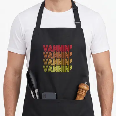
- vannin lifestyle apron
- okay cycling apron
- landscaper funny professionals apron
- funny roofer apron
- relax snarky aprons