
Neat
Straight Fall Apron: Straight Outta Mystic Falls Typography
Straight fall apron - Stacked black and white text reading Straight Outta Mystic Falls inside a rectangular border
US$19.95
Flat US$4.95 US shipping · free over US$65.00 · sales tax is calculated from your shipping address at checkout.
1
US$19.95
Delivery to United States
Arrives —
Orders ship within the United States only. Flat US$4.95 shipping under US$65.00 — free from US$65.00.
Returns
Request a return or exchange within 30 days of purchase, for any reason — we cover return shipping.
Printed to order
Every apron is printed after you order it. Please allow 1-3 business days for processing before it leaves the print shop.
Straight Fall Apron: Straight Outta Mystic Falls Typography is printed on a black canvas apron — one size, made to order and shipped within the United States.
This straight fall apron puts the phrase STRAIGHT OUTTA MYSTIC FALLS across the front panel, and the stacked lettering reads as a direct homage to the fictional setting from a beloved vampire drama. Wearing it connects the user to a specific community of genre fans, and those who follow the show’s complex family dynamics will feel this was made for them. The design uses only black and white ink to create a bold graphic statement that requires no imagery to communicate its meaning effectively.
Reading The Design
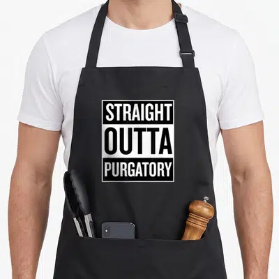
The artwork consists entirely of typography arranged in three distinct lines within a rectangular frame. The top band features a black background with white text reading STRAIGHT, while the middle section reverses this with a white background and black text displaying OUTTA. The bottom band returns to the initial scheme with a black background and white text spelling MYSTIC FALLS. This strict alternation between positive and negative space creates a heavy, solid visual weight that dominates the upper torso. The font is a thick, condensed sans-serif that mimics the style often used in promotional posters for gritty dramas. There are no decorative elements, borders, or illustrations surrounding the text; the message stands alone through the sheer density of the characters and the stark contrast of the monochrome palette. This minimalist approach ensures the reference is legible from a distance and remains the sole focal point of the garment.
When People Wear It
Fans of supernatural television dramas notice the specific location name immediately upon seeing the design. A straight fall apron serves as an excellent gift for birthdays or holidays for anyone who enjoys binge-watching dramatic series. The most common situation for wearing this item is during long viewing sessions or casual gatherings where the wearer wants to express their dedication to the genre. It functions as a conversation starter among friends who share the same pop culture interests without needing to speak. The utilitarian nature of the apron contrasts with the dramatic flair of the slogan, making it a practical accessory for dedicated fandom.
Common Questions
Does the straight fall apron have enough room for pockets? Yes, the straight fall apron includes two front pockets that measure 8 by 7 inches each. These pockets are split in the middle to allow the apron to sit flatter against the body while maintaining ample surface area for holding tools. This specific dimension provides sufficient space for small kitchen essentials without adding excessive bulk to the front panel where the design is printed.
Will the ink on the straight fall apron stay sharp after washing? The ink stays sharp because the design uses solid blocks of color rather than fine gradients or detailed shading. High-contrast typography is generally more durable through repeated laundering than intricate illustrations. The 10 oz cotton canvas substrate also provides a stable base that resists the cracking often associated with softer fabrics after multiple wash cycles.
Is this design suitable for someone who hasn't seen the show? No, the design relies entirely on the specific reference to Mystic Falls to convey its intended meaning. Without knowledge of the fictional town and the associated series, the phrase appears as generic text rather than a recognizable cultural citation. The humor and appeal are derived solely from the shared understanding of the source material between the wearer and the observer.
Every apron is printed after you order it. Orders are processed Monday through Friday, excluding federal holidays — please allow 1-3 business days for order processing. After processing, shipping typically takes 3-7 business days inside the United States, so the total delivery time from order placement is 4-10 business days.
US orders under US$65.00 pay a flat US$4.95 shipping; orders of US$65.00 or more ship free. Bearhap ships within the United States only — we do not ship to international addresses.
You may request a return or exchange within 30 days of the purchase date, for any reason. The apron must be unopened, unused and in its original packaging, with proof of purchase. We refund the item price in full to the original payment method — the original US$4.95 shipping fee is not refundable — and Bearhap covers all return shipping costs: email contact@bearhap.com for a free return label.
Care
Machine wash cold, inside out, with like colours. Tumble dry low or hang to dry. Do not iron directly over the print — press from the back if you need to. No bleach, no dry cleaning.
The ink is water-based and cures into the fabric, so it will soften with the canvas rather than peel off it.
Questions about Neat aprons
- Who is the primary audience for these aprons?
- This collection targets bartenders and home enthusiasts who prioritize precision and tidiness. It appeals to individuals who enjoy the ritual of pouring spirits without ice, valuing a clean workspace that reflects their organized approach to mixology and daily routines.
- What specific designs are included in this set?
- The set features unique prints like the well bourbon apron with classic glassware art and the neat bourbon apron using minimalist text. You also get the straight neat apron with clean lines, the whiskey neat apron with bold lettering, and several variations focusing on cleanliness and traditional cocktail aesthetics.
- How should I choose the right design from this group?
- Select based on your preferred level of detail. Choose the well bourbon apron for intricate glassware imagery or the neat cleaner apron if you favor simple, maintenance-focused themes. Those who appreciate historical cocktail references might prefer the well old fashioned aprons for their educational and decorative appeal.
You might also like
More neat
- straight neat apron
- straight funny neat apron
- outta funny neat apron
- neat lace apron
- mystic fall apron
- straight louisiana apron
- funny outta straight apron
- bestie fall apron