Neat
Straight Kettering Apron Featuring STRAIGHT OUTTA KETTERDAM
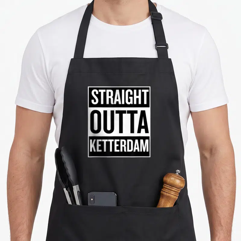
Straight kettering apron - Stacked black and white text reading STRAIGHT OUTTA KETTERDAM in bold block letters
US$19.95
Flat US$4.95 US shipping · free over US$65.00 · sales tax is calculated from your shipping address at checkout.
1
US$19.95
Delivery to United States
Arrives —
Orders ship within the United States only. Flat US$4.95 shipping under US$65.00 — free from US$65.00.
Returns
Request a return or exchange within 30 days of purchase, for any reason — we cover return shipping.
Printed to order
Every apron is printed after you order it. Please allow 1-3 business days for processing before it leaves the print shop.
Straight Kettering Apron Featuring STRAIGHT OUTTA KETTERDAM is printed on a black canvas apron — one size, made to order and shipped within the United States.
straight kettering apron puts the phrase STRAIGHT OUTTA KETTERDAM across the front panel, and the stacked typography reads as a sarcastic take on urban slang. Wearing it signals appreciation for local wit, and anyone connected to Ketterdam feels the design speaks directly to their identity.
Looking At The Front Panel
The artwork consists entirely of bold typography arranged in three distinct horizontal bands against a plain backdrop. The first line displays white letters on a black rectangle, followed by a central line of black text on white, and finished with white text on black at the bottom. A thin black border encloses the entire composition, emphasizing the stark contrast between the two ink colors. This arrangement mimics the visual rhythm of classic album covers but replaces musical references with a specific geographic label. The result is a graphic statement that relies on font weight and negative space rather than illustrations to convey its message.
Who Gets The Joke
This straight kettering apron resonates most with residents who find amusement in recontextualizing popular culture phrases. It acts as a clever gift for someone who views their hometown with affectionate mockery rather than strict reverence. The wearer navigates casual gatherings or kitchen duties while projecting an attitude that values personality over polish. The design bridges the gap between serious culinary utility and lighthearted social interaction.
Answers Up Front
What are the waist tie measurements? Each side measures 42 inches, providing enough length to tie securely in front. This dimension ensures the apron fits various body sizes comfortably without sliding loose during movement. The extra material allows for multiple knot configurations depending on individual preference and hip width.
How does the ink hold up after washing? The printed text remains crisp because the ink sits on the surface rather than soaking deep into fibers. Cold water washes maintain the sharp separation between black and white areas without causing bleed or dullness. Repeated cleaning preserves the high-contrast aesthetic essential to the design's impact.
Why is this specific phrase used instead of a generic slogan? The inclusion of KETTERDAM grounds the humor in a tangible location rather than abstract wordplay. This specificity makes the parody relevant only to those who understand the reference, distinguishing it from mass-produced novelty items. The localized name transforms a universal template into a personal declaration of place.
Every apron is printed after you order it. Orders are processed Monday through Friday, excluding federal holidays — please allow 1-3 business days for order processing. After processing, shipping typically takes 3-7 business days inside the United States, so the total delivery time from order placement is 4-10 business days.
US orders under US$65.00 pay a flat US$4.95 shipping; orders of US$65.00 or more ship free. Bearhap ships within the United States only — we do not ship to international addresses.
You may request a return or exchange within 30 days of the purchase date, for any reason. The apron must be unopened, unused and in its original packaging, with proof of purchase. We refund the item price in full to the original payment method — the original US$4.95 shipping fee is not refundable — and Bearhap covers all return shipping costs: email contact@bearhap.com for a free return label.
Care
Machine wash cold, inside out, with like colours. Tumble dry low or hang to dry. Do not iron directly over the print — press from the back if you need to. No bleach, no dry cleaning.
The ink is water-based and cures into the fabric, so it will soften with the canvas rather than peel off it.
Questions about Neat aprons
- Who is the primary audience for these aprons?
- This collection targets bartenders and home enthusiasts who prioritize precision and tidiness. It appeals to individuals who enjoy the ritual of pouring spirits without ice, valuing a clean workspace that reflects their organized approach to mixology and daily routines.
- What specific designs are included in this set?
- The set features unique prints like the well bourbon apron with classic glassware art and the neat bourbon apron using minimalist text. You also get the straight neat apron with clean lines, the whiskey neat apron with bold lettering, and several variations focusing on cleanliness and traditional cocktail aesthetics.
- How should I choose the right design from this group?
- Select based on your preferred level of detail. Choose the well bourbon apron for intricate glassware imagery or the neat cleaner apron if you favor simple, maintenance-focused themes. Those who appreciate historical cocktail references might prefer the well old fashioned aprons for their educational and decorative appeal.
You might also like
More neat
- straight funny neat apron
- outta funny neat apron
- straight neat apron
- slick meme apron
- foodie ketchup novelty apron
- funny outta straight apron
- straight joke apron
- straight new york apron