Rock Concert
Suck 70s Apron Featuring Disco Sucks Vintage Typography
Suck 70s apron - Stacked Disco Sucks text in yellow and orange gradient lines
US$19.95
Flat US$4.95 US shipping · free over US$65.00 · sales tax is calculated from your shipping address at checkout.
1
US$19.95
Delivery to United States
Arrives —
Orders ship within the United States only. Flat US$4.95 shipping under US$65.00 — free from US$65.00.
Returns
Request a return or exchange within 30 days of purchase, for any reason — we cover return shipping.
Printed to order
Every apron is printed after you order it. Please allow 1-3 business days for processing before it leaves the print shop.
Suck 70s Apron Featuring Disco Sucks Vintage Typography is printed on a black canvas apron — one size, made to order and shipped within the United States.
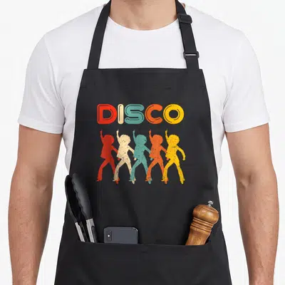
A suck 70s apron puts the printed phrase DISCO SUCKS across the front panel, and the stacked text reads as a sarcastic declaration against a specific music genre. Wearing it protects your clothes from kitchen messes while signaling your preference for rock and roll, and people who attended 1970s concerts or love vintage music culture feel it was made for them.
What You Are Looking At
The artwork consists solely of typography arranged in two stacked lines centered on the fabric. The lettering utilizes a linear gradient that transitions from bright yellow at the top to deep orange at the bottom. This color scheme mimics the aesthetic of 1970s graphic design without depicting any instruments or stage elements. The design belongs to the rock concert and vintage music category because it references a specific cultural rivalry. Every element serves the single purpose of displaying the slogan through font weight and color positioning rather than illustration.
The Right Person For It
Rock musicians and concert attendees notice the bold lettering immediately when they look down. A suck 70s apron makes a perfect gift for a dad, boyfriend, or brother who loves vintage rock music. They wear this garment while cooking dinner before heading out to a festival or clubbing event. The design appeals to anyone who identifies with the anti-disco sentiment found in classic rock fandom.
Details Worth Asking About
What are the dimensions of this suck 70s apron? The body size measures 28 inches wide by 34 inches long to ensure adequate coverage. This standard sizing provides sufficient surface area for the large text to remain visible while protecting the wearer's clothing. The measurements accommodate most adult frames comfortably without being excessively oversized or restrictive.
How does the ink handle washing cycles? The printed design is durable enough to withstand standard laundering without fading or cracking. The ink bonds with the fabric to maintain the sharp edges of the striped typography. Users can wash the apron regularly to keep it clean while preserving the integrity of the yellow and orange gradient.
Does this design reference a specific historical event? Yes, the phrase directly references the 1979 Disco Demolition Night event where disco records were destroyed. This specific cultural moment defined the boundary between the disco era and the rise of punk and hard rock. The design captures that specific moment of musical rebellion through simple text rather than complex imagery.
Every apron is printed after you order it. Orders are processed Monday through Friday, excluding federal holidays — please allow 1-3 business days for order processing. After processing, shipping typically takes 3-7 business days inside the United States, so the total delivery time from order placement is 4-10 business days.
US orders under US$65.00 pay a flat US$4.95 shipping; orders of US$65.00 or more ship free. Bearhap ships within the United States only — we do not ship to international addresses.
You may request a return or exchange within 30 days of the purchase date, for any reason. The apron must be unopened, unused and in its original packaging, with proof of purchase. We refund the item price in full to the original payment method — the original US$4.95 shipping fee is not refundable — and Bearhap covers all return shipping costs: email contact@bearhap.com for a free return label.
Care
Machine wash cold, inside out, with like colours. Tumble dry low or hang to dry. Do not iron directly over the print — press from the back if you need to. No bleach, no dry cleaning.
The ink is water-based and cures into the fabric, so it will soften with the canvas rather than peel off it.
Questions about Rock Concert aprons
- Who is this collection best suited for?
- This collection suits dedicated music fans who attend live shows frequently and appreciate the gritty, authentic aesthetic of concert culture. It appeals to those who value artistic expressions rooted in musical history and venue experiences.
- What themes are included in these designs?
- Designs include punk rock typography, vintage ticket art, and distressed peace symbols. Each piece reflects specific eras of rock music history, focusing on the visual language found in backstage areas, fan merchandise, and stage backdrops throughout the decades.
- How should I choose a design?
- Select based on your favorite musical era or personal style preference. Punk fans may prefer bold lettering, while nostalgic buyers might choose ticket-stub imagery. Consider which visual element best represents your own concert memories and personal connection to the music scene.
You might also like
More rock concert
- rock 70s apron
- concert 70s apron
- funny rock 80s apron
- vintage rock 80s apron
- suck disco seventies apron
- disco 70s apron
- disco music 70s apron
- whoa 70s apron