

Parkinson Awareness
Suck Parkinsons Awareness Apron Featuring Bold White
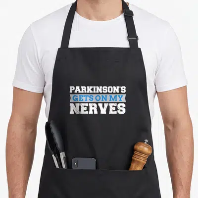
Suck parkinsons awareness apron - White distressed text reading PARKINSONS SUCKS stacked vertically on dark background
US$19.95
Flat US$4.95 US shipping · free over US$65.00 · sales tax is calculated from your shipping address at checkout.
1
US$19.95
Delivery to United States
Arrives —
Orders ship within the United States only. Flat US$4.95 shipping under US$65.00 — free from US$65.00.
Returns
Request a return or exchange within 30 days of purchase, for any reason — we cover return shipping.
Printed to order
Every apron is printed after you order it. Please allow 1-3 business days for processing before it leaves the print shop.
Suck Parkinsons Awareness Apron Featuring Bold White is printed on a black canvas apron — one size, made to order and shipped within the United States.
A suck parkinsons awareness apron puts the words PARKINSONS SUCKS across the front panel, and the stacked white lettering lands as a blunt expression of frustration regarding the neurological disorder. Wearing it allows the wearer to signal solidarity and reject false positivity, and those navigating the daily challenges of the condition or supporting a loved one feel seen by this unvarnished declaration.
The Design Itself
Two lines of white typography dominate the center of the panel, displaying the word PARKINSONS above the word SUCKS in a capitalized, blocky font. The print utilizes a distressed texture that creates gaps and rough edges within the solid white ink, giving the design a worn and gritty appearance. This typographic arrangement avoids images or icons, relying entirely on the weight of the statement and the raw quality of the lettering. The stark contrast between the bright white text and the darker background ensures the message is legible from a distance. Together, the font choice and surface texture reinforce the serious, no-nonsense attitude of the slogan.
Occasions It Fits
Caregivers and support group members notice the immediate honesty of the statement when selecting kitchen gear for daily use. Gifting this item to a patient or partner acknowledges their struggle without offering empty platitudes. The apron serves as a tool for connection in family kitchens or community centers where the reality of the disease is openly discussed. It transforms a mundane cooking task into an act of visibility for those affected by the condition.
Things People Ask
Do the pockets have enough space for tools? Yes, the two front pockets measure 8 by 7 inches each, providing ample room for holding phones, pens, or small kitchen utensils. They are split in the middle to allow access to the waist area without removing the apron. This generous sizing ensures practical utility matches the bold statement printed on the chest.
Will the white text fade after repeated laundering? The durable print withstands standard washing cycles because the ink bonds deeply with the 10 oz cotton canvas fabric. The material itself starts stiff but softens significantly after two or three washes, ensuring comfort increases over time without sacrificing the integrity of the graphic. Proper care maintains the high contrast needed for the message to remain readable.
Is this design specific to Parkinson's disease? Yes, the text explicitly names Parkinsons, distinguishing it from general health or cancer awareness apparel. The phrase Sucks serves as a direct commentary on the physical and emotional toll of this specific neurological condition. No other product carries this exact combination of medical terminology and sarcastic sentiment.
Every apron is printed after you order it. Orders are processed Monday through Friday, excluding federal holidays — please allow 1-3 business days for order processing. After processing, shipping typically takes 3-7 business days inside the United States, so the total delivery time from order placement is 4-10 business days.
US orders under US$65.00 pay a flat US$4.95 shipping; orders of US$65.00 or more ship free. Bearhap ships within the United States only — we do not ship to international addresses.
You may request a return or exchange within 30 days of the purchase date, for any reason. The apron must be unopened, unused and in its original packaging, with proof of purchase. We refund the item price in full to the original payment method — the original US$4.95 shipping fee is not refundable — and Bearhap covers all return shipping costs: email contact@bearhap.com for a free return label.
Care
Machine wash cold, inside out, with like colours. Tumble dry low or hang to dry. Do not iron directly over the print — press from the back if you need to. No bleach, no dry cleaning.
The ink is water-based and cures into the fabric, so it will soften with the canvas rather than peel off it.
Questions about Parkinson Awareness aprons
- Who benefits most from wearing these specific aprons?
- These aprons primarily suit caregivers, medical professionals, and patients themselves who wish to signal their connection to the Parkinson’s community. They serve as talking point for those navigating diagnosis, treatment plans, or long-term management strategies with dignity and public visibility.
- What symbols appear on the different designs?
- Designs feature the official Parkinson’s ribbon, often in orange or gold. Some pieces incorporate religious motifs for spiritual comfort, while others use text-based affirmations about resilience. The visual language focuses on solidarity, recognizing the progressive nature of the condition without stigma or pity.
- How do I choose between the ribbon variations?
- Select the standard ribbon apron for general advocacy and education. Choose the caregiver version if you provide daily hands-on assistance. Opt for the Christ-themed design if faith is central to your coping mechanism. Consider the month-specific item for November campaigns requiring focused attention.
You might also like
More parkinson awareness
- parkinson caregiver awareness apron
- parkinson disease awareness ribbon apron
- parkinson patient apron
- disease patient apron
- parkinson family aprons
- survivor parkinsons awareness apron
- disease warrior parkinsons awareness apron
- suck cancer apron


