Minneapolis
Twin Minnesota Aprons Featuring Crossed Black Oars
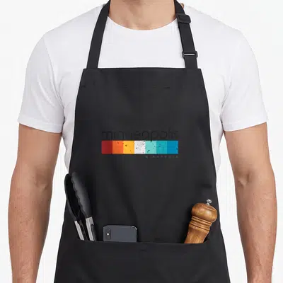
Twin minnesota aprons - Two black oars crossed in X shape with P M L S letters in four quadrants
US$19.95
Flat US$4.95 US shipping · free over US$65.00 · sales tax is calculated from your shipping address at checkout.
1
US$19.95
Delivery to United States
Arrives —
Orders ship within the United States only. Flat US$4.95 shipping under US$65.00 — free from US$65.00.
Returns
Request a return or exchange within 30 days of purchase, for any reason — we cover return shipping.
Printed to order
Every apron is printed after you order it. Please allow 1-3 business days for processing before it leaves the print shop.
Twin Minnesota Aprons Featuring Crossed Black Oars is printed on a black canvas apron — one size, made to order and shipped within the United States.
twin minnesota aprons puts two solid black oars across the front panel, crossing them in an X formation so that the letters P, M, L, and S sit clearly in the four open spaces around the center point. This minimalist layout reads as a standard abbreviation for Minneapolis, grounding the design in the specific geography of the Twin Cities rather than generic nautical imagery. Wearing it connects the wearer to a community of local paddlers and lake residents, and people who spend their weekends on the water will feel this design speaks directly to their daily life.
Reading The Design
Two black oars dominate the central space, arranged symmetrically to create a bold cross shape that anchors the entire composition. The letters P, M, L, and S are placed individually in the quadrants formed by the intersection, filling the negative space without overlapping the wood. This monochromatic approach uses only the color black to maintain a clean, uncluttered visual that relies on strong typography and simple silhouettes. The imagery belongs firmly to the outdoor recreation trade of kayaking and canoeing, reflecting the city's reputation as a hub for water sports. Together, the crossed tools and the abbreviated text form a unified emblem of local identity that requires no explanation beyond what is printed.
When People Wear It
People who participate in Minnesota’s extensive paddling scene notice the specific combination of equipment and location code immediately. This twin minnesota aprons makes a thoughtful gift for anyone who wants to celebrate their home state while working in the kitchen or garden. It appears most often in casual settings where outdoor passion meets domestic routine, bridging the gap between the lake and the living room.
Common Questions
What is the neck strap length? The neck strap measures between 20 and 30 inches, allowing for significant adjustment to fit various torso sizes. This range ensures the bib sits at the correct height whether the wearer is tall or short, preventing the apron from sliding down or digging into the neck during use.
How does the ink hold up in the wash? The print remains durable because the design utilizes large, solid blocks of color that resist cracking better than fine details. Since the artwork consists of simple shapes and letters rather than gradients or small text, the ink bond stays intact through repeated laundering cycles without fading or peeling.
Why are these specific letters used instead of the full city name? The letters P, M, L, and S function as a widely recognized acronym for Minneapolis, which is culturally synonymous with the region's outdoor identity. Using the abbreviation creates a more compact and graphic symbol that fits neatly within the geometry of the crossed oars, avoiding the visual clutter of a full word.
Every apron is printed after you order it. Orders are processed Monday through Friday, excluding federal holidays — please allow 1-3 business days for order processing. After processing, shipping typically takes 3-7 business days inside the United States, so the total delivery time from order placement is 4-10 business days.
US orders under US$65.00 pay a flat US$4.95 shipping; orders of US$65.00 or more ship free. Bearhap ships within the United States only — we do not ship to international addresses.
You may request a return or exchange within 30 days of the purchase date, for any reason. The apron must be unopened, unused and in its original packaging, with proof of purchase. We refund the item price in full to the original payment method — the original US$4.95 shipping fee is not refundable — and Bearhap covers all return shipping costs: email contact@bearhap.com for a free return label.
Care
Machine wash cold, inside out, with like colours. Tumble dry low or hang to dry. Do not iron directly over the print — press from the back if you need to. No bleach, no dry cleaning.
The ink is water-based and cures into the fabric, so it will soften with the canvas rather than peel off it.
Questions about Minneapolis aprons
- Who is the ideal wearer for these prints?
- These designs suit long-time residents who recognize specific streets and venues. They also appeal to newcomers eager to display their new home base with authentic pride rather than generic symbols.
- What themes are featured in this set?
- We include references to local music, architecture, and neighborhood abbreviations. The artwork focuses on insider knowledge that only someone living in the Twin Cities would fully appreciate or understand immediately.
- How do I choose the best design?
- Select based on your favorite district or hobby. Music lovers might prefer the vinyl reference, while home cooks may connect with the street food culture depicted in other options within this group.
You might also like
More minneapolis
- minneapolis minnesota aprons
- minneapolis souvenir minnesota aprons
- funny minneapolis minnesota aprons
- minneapolis mn aprons
- souvenir minnesota aprons
- letter minnesota aprons
- twin minnesota apron
- mpl minnesota aprons