

Tired
Waking Italian Apron Features 'I'M TIRED OF WAKING UP
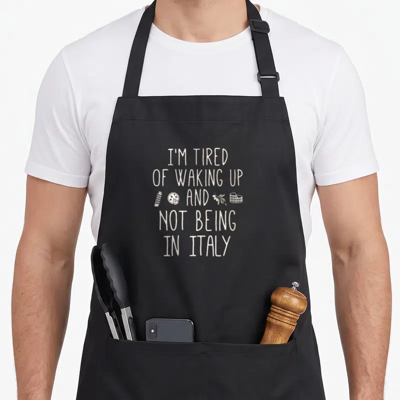
Waking italian apron - Off-white text reading I'M TIRED OF WAKING UP AND NOT BEING IN ITALY with tower pizza olive
US$19.95
Flat US$4.95 US shipping · free over US$65.00 · sales tax is calculated from your shipping address at checkout.
1
US$19.95
Delivery to United States
Arrives —
Orders ship within the United States only. Flat US$4.95 shipping under US$65.00 — free from US$65.00.
Returns
Request a return or exchange within 30 days of purchase, for any reason — we cover return shipping.
Printed to order
Every apron is printed after you order it. Please allow 1-3 business days for processing before it leaves the print shop.
Waking Italian Apron Features 'I'M TIRED OF WAKING UP is printed on a black canvas apron — one size, made to order and shipped within the United States.
The phrase 'waking italian apron' introduces a design that reads 'I'M TIRED, OF WAKING UP, AND, NOT BEING, IN ITALY' across the front. This typography-only layout uses off-white lettering stacked in five lines to express a wholesome longing for travel. Wearing it signals a shared appreciation for Italian landmarks without needing a suitcase, and digital nomads or expats feel this was made specifically for their wanderlust.
The Artwork Explained
The central focus is the white text arranged in a vertical stack that occupies the majority of the upper panel space. Flanking the word 'AND' in the third line are four small, distinct icons: a Leaning Tower of Pisa, a pizza slice, an olive branch, and the Colosseum. These graphics are rendered in the same off-white tone as the lettering to maintain a cohesive, single-color aesthetic. The composition relies entirely on the interplay between the bold sans-serif font and these miniature symbols of Italian heritage. There are no background gradients or complex scenes, just the stark contrast of the printed elements against the base material. This arrangement transforms a simple complaint into a stylized tribute to a favorite destination.
Kitchens It Belongs In
This apron belongs in the workspace of a home cook who treats Italian cuisine with reverence or a traveler documenting their culinary adventures. The two front pockets, each measuring 8 x 7 inches and split in the middle, make it functional for holding utensils or cleaning cloths during meal prep. It serves as a gentle reminder of distant sunsets and historic sites for anyone currently living outside Europe. The design appeals to people who enjoy the culture of Rome, Milan, or Naples but spend their days in a local kitchen. It turns a mundane work task into an expression of personal geography and taste.
What Buyers Ask
What are the dimensions of the pockets and how does the material feel initially? The pockets measure exactly 8 x 7 inches and are split down the center for easy access. The 10 oz cotton canvas fabric is noticeably stiff when you first receive it, providing a structured look that holds its shape well. After washing the apron two or three times, the material breaks in and softens considerably, becoming much more comfortable against your skin while retaining its durability.
Does the white ink resist fading during repeated laundry cycles? The ink is designed to withstand regular washing because the cotton canvas absorbs the pigment deeply during the printing process. Since the design uses only solid white lettering and simple icons without fine gradients, there are no delicate areas prone to cracking or peeling. You can safely machine wash this item with cold water and hang it dry to preserve the crispness of the five-line text layout indefinitely.
Why does this product use icons instead of a photograph of a city? The design follows a typography-only art style that prioritizes the written message over a scenic image. By using symbolic representations like the pizza slice and olive branch, the apron conveys the essence of Italy without depicting a specific street or building. This abstract approach makes the humor broader and more timeless than a photo of a crowded tourist spot would, focusing purely on the feeling of being away from home.
Every apron is printed after you order it. Orders are processed Monday through Friday, excluding federal holidays — please allow 1-3 business days for order processing. After processing, shipping typically takes 3-7 business days inside the United States, so the total delivery time from order placement is 4-10 business days.
US orders under US$65.00 pay a flat US$4.95 shipping; orders of US$65.00 or more ship free. Bearhap ships within the United States only — we do not ship to international addresses.
You may request a return or exchange within 30 days of the purchase date, for any reason. The apron must be unopened, unused and in its original packaging, with proof of purchase. We refund the item price in full to the original payment method — the original US$4.95 shipping fee is not refundable — and Bearhap covers all return shipping costs: email contact@bearhap.com for a free return label.
Care
Machine wash cold, inside out, with like colours. Tumble dry low or hang to dry. Do not iron directly over the print — press from the back if you need to. No bleach, no dry cleaning.
The ink is water-based and cures into the fabric, so it will soften with the canvas rather than peel off it.
Questions about Tired aprons
- Who should buy these aprons?
- These aprons suit anyone feeling chronically exhausted by work or life. They appeal to people who use humor to process fatigue, making them perfect gifts for friends or family members who constantly complain about being tired. The designs validate their feelings through witty visuals.
- What makes this collection unique?
- This collection stands out by blending relatable exhaustion with iconic imagery and cultural references. Unlike generic tired quotes, it features specific characters and themes like Marilyn Monroe or Italian drama. Each design offers a distinct flavor of weariness, ensuring there is a style that matches your specific type of burnout.
- How do I choose a design?
- Select a design based on your personal connection to the theme. If you love vintage cinema, pick Marilyn Monroe. If you prefer animals, Eeyore might resonate. Consider your daily stressors; a battery design suits tech workers, while an Italian theme fits those who express emotion dramatically. Choose what best reflects your current mood.
You might also like
More tired
- tired italian apron
- tired hawaiian apron
- tired goth apron
- tired vlogger apron
- addictive italian aprons
- tired swiss apron
- tired french apron
- awake novelty apron


