Supervisor
Wrong Supervisor Apron Featuring the Text I'M a SUPERVISOR
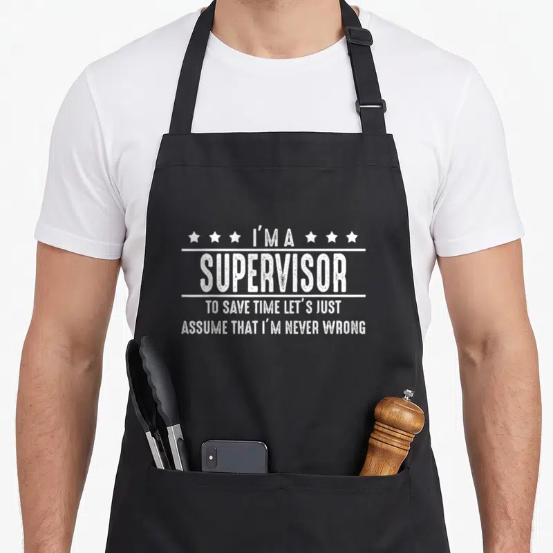
Wrong supervisor apron - White distressed text reading I'M A SUPERVISOR TO SAVE TIME LET'S JUST ASSUME THAT I'M NEVER
US$19.95
Flat US$4.95 US shipping · free over US$65.00 · sales tax is calculated from your shipping address at checkout.
1
US$19.95
Delivery to United States
Arrives —
Orders ship within the United States only. Flat US$4.95 shipping under US$65.00 — free from US$65.00.
Returns
Request a return or exchange within 30 days of purchase, for any reason — we cover return shipping.
Printed to order
Every apron is printed after you order it. Please allow 1-3 business days for processing before it leaves the print shop.
Wrong Supervisor Apron Featuring the Text I'M a SUPERVISOR is printed on a black canvas apron — one size, made to order and shipped within the United States.
The exact phrase "wrong supervisor apron" introduces the printed text "I'M A SUPERVISOR TO SAVE TIME LET'S JUST ASSUME THAT I'M NEVER WRONG". This white, distressed lettering reads as a sarcastic defense of management authority. Wearing it signals that you appreciate the humor in workplace hierarchy without taking yourself too seriously. Team leads and shift managers who navigate difficult staff situations daily will recognize this specific sentiment immediately.
The Design Itself
The main subject consists entirely of text printed in white distressed ink across the center panel. Four lines of stacked lettering display the full message, separated by two horizontal lines that frame the word SUPERVISOR. Three stars sit on either side of the first line, creating a symmetrical border around the opening declaration. The font style mimics worn stenciling or vintage signage to enhance the cynical tone of the statement. This visual arrangement belongs to the trade of supervision where asserting confidence is often more effective than admitting error. The combination of geometric separators and star icons transforms a simple sentence into a badge of ironic office identity.
Occasions It Fits
Supervisors and team leads notice the specific phrasing about never being wrong first. Gifting this wrong supervisor apron to a new manager acknowledges the pressure of their position with humor. They wear it during chaotic shifts when explaining complex decisions becomes repetitive and tedious. The design acts as a shield against micro-management complaints from subordinates by preemptively stating the boss's stance. Service industry workers and retail floor managers find this garment essential for maintaining morale during high-stress periods.
Things People Ask
What are the measurements of the front pockets on this wrong supervisor apron? The front pockets measure exactly 8 by 7 inches each, providing ample space for pens and small tools. They are positioned low on the bib and split in the middle to allow for easy access from both sides. This specific dimension ensures that heavy items do not drag the stiff 10 oz cotton canvas down excessively. The split construction also prevents the pocket fabric from bunching up when filled with standard work essentials like clipboards or phones.
How does the white ink hold up after repeated laundering cycles? The white distressed ink is durable enough to withstand standard washing because the print penetrates the thick cotton weave. The distressed texture actually helps mask minor fading that occurs over time, keeping the design looking intentionally aged rather than damaged. You can wash this garment inside out with cold water to preserve the integrity of the lettering and stars. Avoid using bleach or high heat drying to maintain the crispness of the white characters against the dark background.
Why is the specific text layout arranged with stars and horizontal lines? The layout uses stars and lines to mimic the visual language of official badges or military insignia. Two horizontal lines sandwich the central word SUPERVISOR to emphasize its importance within the hierarchy of the statement. Six stars flank the top line to suggest authority and rank, contrasting with the casual admission of arrogance below. This graphic structure elevates the sarcastic quote from a mere sentence to a formal declaration of managerial status.
Every apron is printed after you order it. Orders are processed Monday through Friday, excluding federal holidays — please allow 1-3 business days for order processing. After processing, shipping typically takes 3-7 business days inside the United States, so the total delivery time from order placement is 4-10 business days.
US orders under US$65.00 pay a flat US$4.95 shipping; orders of US$65.00 or more ship free. Bearhap ships within the United States only — we do not ship to international addresses.
You may request a return or exchange within 30 days of the purchase date, for any reason. The apron must be unopened, unused and in its original packaging, with proof of purchase. We refund the item price in full to the original payment method — the original US$4.95 shipping fee is not refundable — and Bearhap covers all return shipping costs: email contact@bearhap.com for a free return label.
Care
Machine wash cold, inside out, with like colours. Tumble dry low or hang to dry. Do not iron directly over the print — press from the back if you need to. No bleach, no dry cleaning.
The ink is water-based and cures into the fabric, so it will soften with the canvas rather than peel off it.
Questions about Supervisor aprons
- Who is this collection best suited for?
- This collection is ideal for managers, team leads, and facility supervisors who appreciate humor in the workplace. It suits anyone who deals with daily operational challenges and wants to express their role with wit. The designs appeal to those who value camaraderie and shared experiences in high-pressure environments.
- What types of designs are included?
- The assortment features themes ranging from movie references like Regular Show to industry-specific nods such as trailer logistics and maintenance work. You will find meme-inspired graphics and subtle Easter eggs. Each design targets a different aspect of supervisory life, from educational settings to industrial sites.
- How should I choose a design?
- Select a design that reflects your specific job environment or personal sense of humor. If you work in education, the show teacher apron may fit well. For those in logistics, the trailer-themed options might resonate more. Consider whether you prefer bold statements or subtle references when making your choice.
You might also like
More supervisor
- show supervisor apron
- cute supervisor apron
- supervisor joke apron
- supervisor maintenance apron
- appreciation maintenance apron
- show supervisor boss apron
- boss professional apron
- appreciation employee aprons