Data
Avoid Data Apron Featuring a Statistics Pun with Blue
Avoid data apron - Blue and white text around a vertical-lined bell curve with dotted center line
US$19.95
Flat US$4.95 US shipping · free over US$65.00 · sales tax is calculated from your shipping address at checkout.
1
US$19.95
Delivery to United States
Arrives —
Orders ship within the United States only. Flat US$4.95 shipping under US$65.00 — free from US$65.00.
Returns
Request a return or exchange within 30 days of purchase, for any reason — we cover return shipping.
Printed to order
Every apron is printed after you order it. Please allow 1-3 business days for processing before it leaves the print shop.
Avoid Data Apron Featuring a Statistics Pun with Blue is printed on a black canvas apron — one size, made to order and shipped within the United States.
The phrase avoid data apron puts the text AVOID THE TOP OF THE BELL CURVE EVERYONE THERE IS MEAN across the front panel, and this pun reads as a warning against statistical outliers. Wearing it signals you understand the double meaning of mean, and statisticians who love wordplay feel this was made for them.
What The Print Says
Light blue and white typography sits above and below a bell curve graphic that dominates the center of the panel. The curve itself is filled with vertical lines and features a central dotted vertical line running through its peak. The layout splits the sentence into two parts, framing the statistical symbol between the instruction and the conclusion. This visual structure reinforces the pun by placing the concept of the curve directly between the words describing it. The design belongs to the realm of data science humor where mathematical concepts become the basis for jokes.
The Cook It Was Made For
Data scientists and analysts notice the pun immediately because they recognize the dual definition of mean. This avoid data apron works perfectly as a birthday or Christmas gift for someone passionate about data mining and machine learning. Everyday use happens in professional kitchens or lab environments where the wearer wants to display niche expertise without speaking. The design appeals to those who find joy in the specific intersection of cooking and complex statistical theory.
Ordering Questions
Does the waist tie length accommodate different body sizes? Yes, the waist ties measure 42 inches on each side, ensuring enough fabric to wrap around various torso widths and tie securely in front. This specific dimension provides flexibility for different build types while maintaining the necessary tension to keep the apron in place during active use. Can the printed design withstand repeated washing cycles? The ink durability is designed to hold up through standard laundering processes because the print is integrated into the fabric surface rather than sitting loosely on top. Proper care instructions ensure the light blue and white colors remain distinct without fading or cracking after multiple washes. Why is the specific phrasing about the bell curve necessary for the joke? The joke requires the explicit mention of the bell curve because the visual representation of the normal distribution is essential to understanding why everyone at the top is mean. Without the graphic and the specific reference to the curve's peak, the statistical pun regarding the arithmetic mean would lack context and fail to land with the intended audience.
Every apron is printed after you order it. Orders are processed Monday through Friday, excluding federal holidays — please allow 1-3 business days for order processing. After processing, shipping typically takes 3-7 business days inside the United States, so the total delivery time from order placement is 4-10 business days.
US orders under US$65.00 pay a flat US$4.95 shipping; orders of US$65.00 or more ship free. Bearhap ships within the United States only — we do not ship to international addresses.
You may request a return or exchange within 30 days of the purchase date, for any reason. The apron must be unopened, unused and in its original packaging, with proof of purchase. We refund the item price in full to the original payment method — the original US$4.95 shipping fee is not refundable — and Bearhap covers all return shipping costs: email contact@bearhap.com for a free return label.
Care
Machine wash cold, inside out, with like colours. Tumble dry low or hang to dry. Do not iron directly over the print — press from the back if you need to. No bleach, no dry cleaning.
The ink is water-based and cures into the fabric, so it will soften with the canvas rather than peel off it.
Questions about Data aprons
- Who should buy this apron?
- This collection is ideal for software engineers, data analysts, and IT professionals who enjoy workplace humor. It also appeals to computer science students and teachers who want to display their passion for technology through witty, niche-specific graphic designs on durable canvas bibs.
- What themes are included?
- The assortment covers programming concepts like parameters, data extrapolation, and incomplete datasets. It also includes playful elements such as cats and emotional data mappings. Each design reflects specific aspects of the tech industry, from coding challenges to classroom education environments.
- How do I choose?
- Select based on your specific role or favorite technical concept. Developers might prefer parameter or generation themes. Educators may like the classroom-friendly options. Cat enthusiasts can choose the feline print. Pick the design that best matches your daily work environment or personal sense of style.
You might also like
More data
- avoid statistics apron
- scientist engineer apron
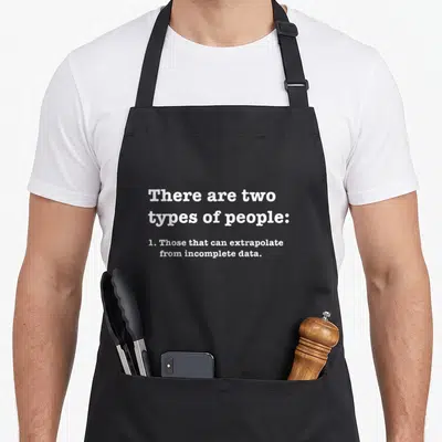
- extrapolate statistics apron
- incomplete data jokes apron
- incomplete data apron
- statistic science apron
- those statistics apron
- statistic formula apron